

What Color Goes With Salmon Paint? (Find Out Now!)
When it comes to choosing colors that are difficult to pair with, salmon paint might be one of the worst offenders. Finding a color that works with it can prove to be very tricky. If you love this bright pink-orange hue, don’t worry. We’ve found some of the best colors to pair with it.
The best colors to pair with salmon include blue, turquoise, and green. If you want to go for neutrals, grey and white tend to be the best pairings. When choosing paints for salmon rooms, make sure that you avoid bold reds or oranges since it can be overwhelming. In smaller quantities, yellows can work.
Salmon is one of those colors that people love to hate. Or, it is a color people want to have in their home, but just can’t quite pair. Let’s make it possible by looking at top picks.
Do You Need to Hire a Paint Contractor?
Get free, zero-commitment quotes from pro contractors near you.

What Colors Work Well With Salmon Paint?
Salmon is a bit dicey, which is to be expected. It’s a bit strange as a color. These picks will help you make the most of your paint time.
1. Grey
Grey and salmon pink make one of the most stereotypically Millennial pairings imaginable. But, stereotypes are a thing for a reason. It looks good. Moreover, it has a rather trippy effect. The heavy pink of salmon tends to act as a foil against the grey, giving most greys the illusion of being blue-grey.
It’s a cool contrast that remains modern. Since grey is very popular these days, you can expect this color pairing to work to your advantage if you’re big into trends. It’s a cool way to turn a typically femme color into a gender-neutral look, too.
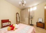
2. Light Turquoise
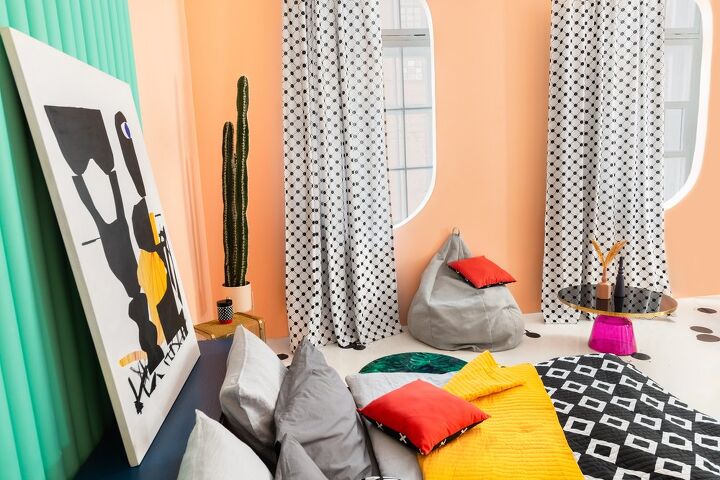
During the 1980s, pastel salmon was almost always paired with a light turquoise—like the curtain found in this room above. It was a classic pairing that you would see all over cities in Florida. It’s a little oceanic, a little Miami Vice, and that’s the way people liked it back then.
Personally, I’ll always love this look. It’s tropical, retro-modern, and chock-full of pop art cuteness. The contrast also offers a very nice balance between these two colors. If you want something edgy without it being crazily edgy, I’d strongly suggest this pairing.
Oh, and it’s also worth noting that turquoise and salmon pink tend to do well with each other if you are seeking out a Southwestern look. It’s remarkably versatile like that.
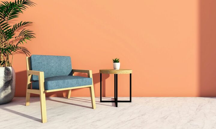
3. Deep Blue
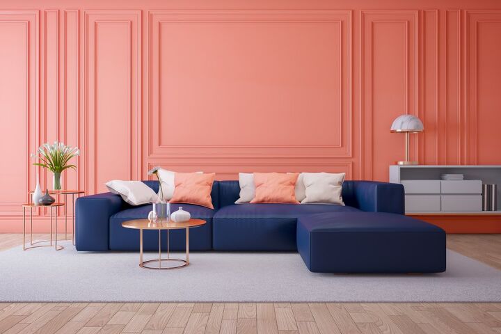
Are you looking for a way to add a dash of luxury to your salmon-colored home? Look no further than a deep blue. Deep blue is salmon’s complementary color and it’s one of the best ways to make sure that you get a major contrast that makes your room pop. Unlike turquoise, deep blues don’t look dated or locked into any particular time people.
Deep blues can be hard to work with if you have a smaller room. However, if you are lucky enough to have a spacious room, it will look amazing. People often remark about how unusual this combination is—and that’s not a bad thing here. It’s downright mesmerizing when done correctly.
4. White
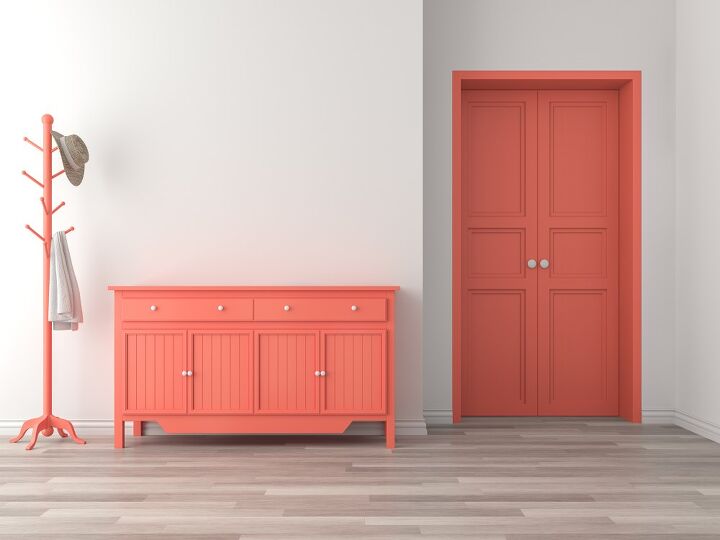
White is the universal neutral, and that means it is remarkably good at matching with anything. When you add salmon pink to a white background, you get a neo-tropical look that is smart, classy, and feminine. This is the best pick for people who really want their salmon furniture to pop out and look bold.
If you are a huge fan of working with strong colors as the focal point of your room, this is a good way to go. White also has the added perk of working with all other colors. So, it’ll give you the vibe you want without too much of a problem.
5. Emerald Greens
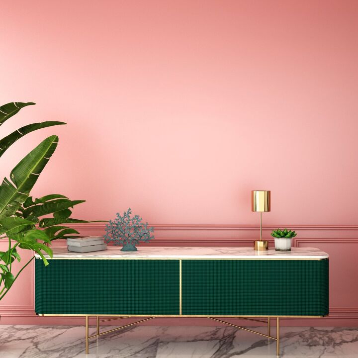
Ooh la la! Take a look at this combo, and you’ll quickly understand why salmon and emerald green go together. The green offers a good contrast with the pink elements, all while helping downplay the more obnoxious shades of orange that certain types of salmon paint can have. The end result is gorgeous!
Green is a good pick for people who want to give their home a taste of the tropics. Much like turquoise, it gives off that very elegant yet retro-cool “Miami” vibe that people adored back in the day. It’s beachy, but also gives you the same mood as an upscale greenhouse. Dark blue-green like the cabinet works well, but so does brighter shades of emerald.
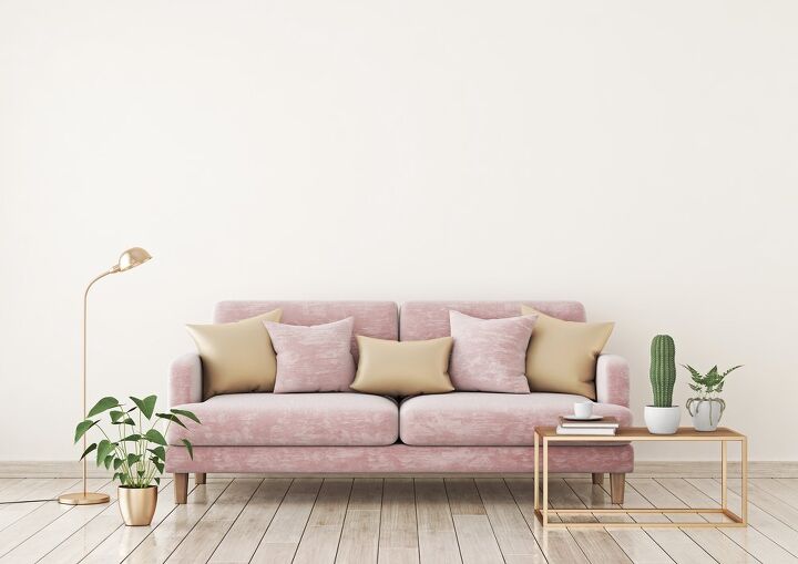
6. Gold
When you have a home that is heavy on a rosy pink like salmon, there tends to be a desire to tone down the golden tones it has. But, is this really the best option? We’re not so sure. Gold is actually the metal accent color that pairs best with this shade. Gold and salmon go together like PB&J…or salmon and Hollandaise sauce.
If you want to go for a gold tone with your salmon-hued room, make sure that it’s not rose gold. Rose gold tends to look way too much like the actual paint itself, leading to a deep impression of overkill. Yellow gold tends to help highlight the pink while downplaying the yellow in the paint.
This is why a lot of “Millennial” furniture features gold and salmon upholstery. It looks good, classic, and modern all at the same time.
7. Sage Green
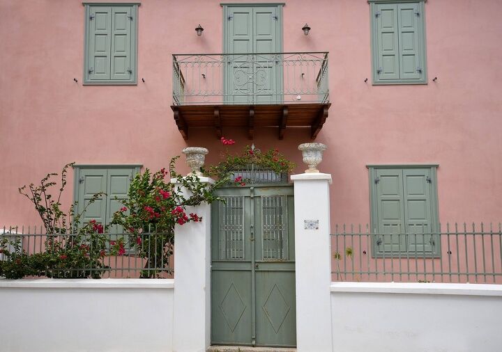
Most people associate salmon pink with Miami styling or 80s glam. This is not wrong, but there are so many other ways to make this color work. Here, we see what happens when you pair salmon walls with sage green accents. Surprisingly pretty? Oh, yes. In fact, that’s kinda what makes this green a popular pick among traditional designers.
To many peoples’ surprise, this was actually a common color combination in parts of Europe during the last century. If you are a fan of Neoclassical design or just want to kick it in a French chateau, this is a color combination you’re going to adore. Our suggestion? Follow this combination up with plenty of florals. You can’t get more Old World Charm than that.
8. Beige
Beige is another one of those neutral colors that can go with almost anything. In the case of salmon pink (or dusty salmon, like in the photo above), beige offers a way to make the colors look brighter without actually making your room look stark. Unlike most other neutrals, beige also has the perk of giving your room a little bit of warmth.
Cozy and chic, you can’t get a better color for salmon than a nice sandy beige like the shade of the pillows above. If you are seeking a color combination that offers up a more modern veneer, then this is a good pick. With that said, beige is also popular for people who want to have two main focal colors as well as a main accent color.
Do You Need to Hire a Paint Contractor?
Get free, zero-commitment quotes from pro contractors near you.
9. Mint Green
When mint green first became really popular, it was the earlier part of the 1950s. It was a cheerful, bold, and bright color that became synonymous with the “retro homemaker” look that’s coming back into style. It also happens to be one of the most popular colors to pair with salmon pink, especially back in the day. Talk about retro fab!
Today, this color combination is pretty famous for bringing people back to an era where things were all about the Big Bopper and Elvis Presley. While retro is the number one vibe that people get with this, it’s also pretty popular for tropical and oceanic homes, too. If you are looking for a gender-neutral room for a kid, these bright colors can also be a good pick.

Ossiana Tepfenhart is an expert writer, focusing on interior design and general home tips. Writing is her life, and it's what she does best. Her interests include art and real estate investments.
More by Ossiana Tepfenhart