

What Color Goes With Peanut Butter Paint? (Find Out Now!)
When people think of paint colors, the words “peanut butter” don’t usually register. However, it is a paint color. It’s kind of brown, but very light brown, with just a hint of orange. Many people liken it to a less pink version of terra cotta. It’s popular, but it can be hard to pair. So, what colors can you add to make your home look good?
Peanut butter paint pairs well with other neutrals and warmer colors. This means that white, beige, dark brown, taupe, and yellows can all work well with it. If you want to add a bold splash of color, try red or even turquoise.
This is not a color that is going to be easy to pair, even if you are a natural maverick at interior design. Thankfully, we were able to dig up some colors that will pair as well as peanut butter and jelly!
Do You Need to Hire a Paint Contractor?
Get free, zero-commitment quotes from pro contractors near you.

What Are The Best Colors To Pair With Peanut Butter Paint?
Peanut butter paint is unique in the way that it looks. It *technically* is a neutral color, but it’s definitely a warm neutral that seems to pair with reddish or yellow tones. Let’s take a look at our top picks.
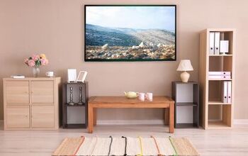
1. White

White is a universally flattering paint color that offers a lot of contrast when paired with a dark shade of peanut butter. White helps reduce the chances of a room looking too dim, and it also can offer up a nice bold outline. If you have crown molding, then it’s a great way to highlight that personal styling.
Having white trim is a good way to add continuity to your room with peanut butter paint on the walls. If you need to make your room look a bit larger and want light to be let in, then this is the best option out there.
2. Brown

Is it a trick of the light, or is it a different shade of brown? It can be quite hard to tell, as this cute example above shows us. That’s the trippy appeal of adding brown to a wall that has a peanut butter wall. A warmer, darker shade of brown can offer up an interesting twist of dimension to a room where you might have an otherwise flat look.
The key to making this look work is to choose a brown that is just a shade or two darker or lighter than your peanut butter paint. If you are a fan of monochromatic looks or rustic looks, this color scheme definitely will earn a place in your heart.
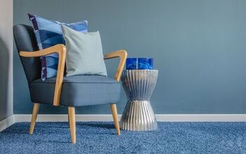
3. Grey

This is a different twist on a typical paint pairing look, isn’t it? Kind of. This shows a cool color pairing that involves peanut butter walls and grey painted lacquer cabinetry. This color combination is counterintuitive, but it works well as long as you choose your paints carefully.
Here, it gives a unique contrast that is bold yet at the same time, understate. The trick to getting greu to work here is to choose a grey that has the same darkness/lightness as your peanut butter. It gives the room a very cohesive look that is almost monochromatic, but not quite.
4. Orange
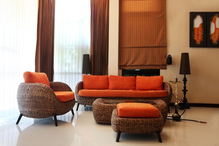
In this example, we have two different shades of peanut butter visible in this photo. The walls are a light peanut butter, while the curtain over the door is a darker peanut butter shade. That gives the room a beautiful monochromatic look. But, it still needed a little bit of warmth.
Orange is remarkably good with peanut butter shades. That’s actually why orange and peanut butter were paired together so frequently during the 1970s. Is it a bit retro? Yes, but that’s part of the charm. To get an even more disco-tastic look, add a splash of harvest yellow to the mix.
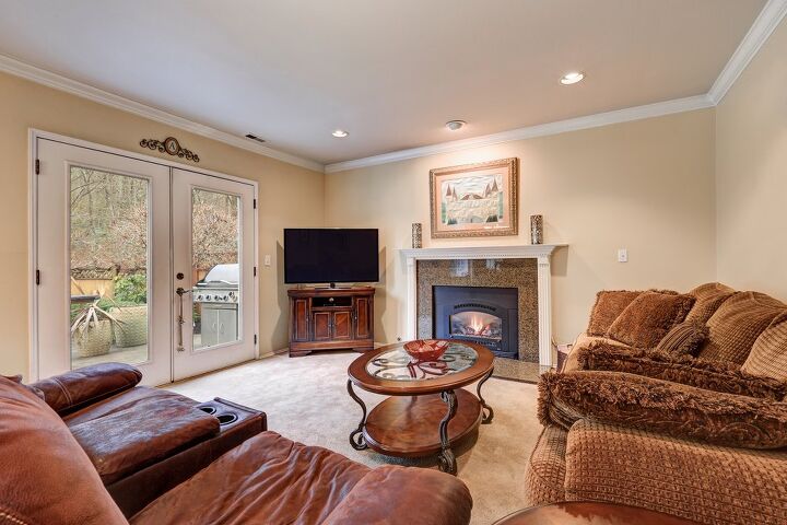
5. Black

Peanut butter is one of those colors that tends to require neutrals of some sort, especially if your lighting will cast a warm glow over it. This hotel designer noticed that the lampshades would cast a golden shade over the already warm peanut butter paint. So, he did something smart and stuck to neutrals.
In this case, the black headrest of the bed acts as a focal point to the room while it also helps add contrast. This might not be ideal for a wall trim color in most cases, but when it comes to adding flair to your cabinets or furniture, it’s a good pick. Besides, black is a universally flattering neutral.
6. Red

Sometimes, the best thing you can do with a quasi-warm color like peanut butter is dial up the heat a bit more. Red is one of those colors that can add a bold streak of style to a room that’s already looking to be cozy and regal. In this case, red wasn’t used as a paint color. Rather, it was the accent color for pillows, a bedspread, and some curtains.
This brick red works very well with the undertones of the peanut butter color here. The trick to getting the right shade is to pick something that is slightly muted in its appearance. Crazy fire engine reds often are a bit too bold for the look of peanut butter. Burnt brick, a rich burgundy, and something that is closer to a brownish red tends to look more harmonious.
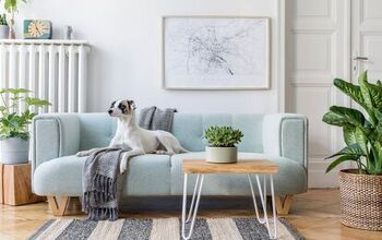
7. Green

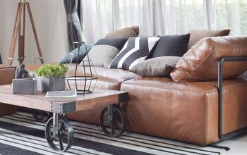
Green is one of those few cool colors that can work with a warm neutral beautifully. With peanut butter shades (like the wood stain on this sofa and the surrounding furniture), you have a very woody type of brown. Peanut butter has a yellow undertone that works with green.
When put together, green and brown give you an elegant, sophisticated ambiance that could easily be considered “Ivy League chic.” Of course, it also tends to remind people of trees and plants found in nature. So, if you’re a fan of forest looks, you also might want to get a bucket or two of green paint.
8. Turquoise

Peanut butter paint is one of the better shades of brown if you want to pair it with a vibrant shade of blue. Turquoise, in particular, tends to be a good pick. The yellowy, almost greenish undertones of turquoise tends to bring out the woody look of peanut butter paint. That gives it a unique contrast that will pop in almost any home.
If you want something exotic or eye-catching, turquoise is a smart play. The example above used a faded turquoise paint with gold leaf accents. You don’t have to stick to that look to use turquoise beautifully. If you want, you can also try a flat turquoise as a way off adding some contrast to your look. Patterned wallpaper is amazing for this.
Do You Need to Hire a Paint Contractor?
Get free, zero-commitment quotes from pro contractors near you.
Related Questions
What is peanut skin color?
If you see a color on sale called “peanut skin,” you should expect to see a medium brown with a reddish tint. Many people find it to be almost indistinguishable from burnt brick. It’s also worth noting that peanut skin is not the same color as peanut butter. Don’t confuse the two if you are looking to patch up a hole in your paint.
Is peanut butter a neutral color?
Peanut butter is generally seen as a standard brown and it goes through a number of names, depending on the manufacturer. Like other browns, it’s considered to be a neutral color.
Why is peanut butter such a standardized color?
You might have noticed that peanut butter is a very particular shade of brown. This is because peanut butter, which inspired the paint, has a regulation on the color it has to be. If peanut butter isn’t the right color, the USDA will not allow companies to call it peanut butter. So it’s actually codified.

Ossiana Tepfenhart is an expert writer, focusing on interior design and general home tips. Writing is her life, and it's what she does best. Her interests include art and real estate investments.
More by Ossiana Tepfenhart


![Standard Dining Room Table Dimensions [for 4, 6, 8, 10 and 12 People]](https://cdn-fastly.upgradedhome.com/media/2023/07/31/9074335/standard-dining-room-table-dimensions-for-4-6-8-10-and-12-people.jpg?size=350x220)