

What Color Curtains Go With Red Walls?
Red is one of my favorite colors. It is a color of war, passion, love, and boldness. It’s a bold color that often finds itself being used as a fringe color in interior design. If you made the bold choice of red walls, you need to choose a good curtain color. But, what goes well with red walls?
White, black, grey, and beige are the best neutral curtain colors for red walls. Colors that work well for red rooms include pink, purple, orange, and gold. If you feel like you are at a loss for a good color to match your wall, simply buy red curtains. It’s timeless.
Choosing the right curtains will help frame your room well and emphasize your colors. Let’s take a look at the best choices for red walls right now.
Do You Need an Interior Decorator?
Get free, zero-commitment quotes from pro contractors near you.

What Curtain Colors Work Best For Red Walls?
Red is a very strong color, which means that you might need to go the extra mile in order to ensure your room doesn’t look too wild. Let’s look at our top choices…
1. Deep Purple
Ooh, now this is positively regal!
Deep purple offers a beautiful way to add a touch of unexpected blues to a room with a red wall. This is a great way to add color balance and tone down orangey or gold hues in a red room. It also is fairly unexpected, because let’s face it, we don’t usually see purple and red together like that.
Is it bold? Yes, and it offers up contrast that isn’t quite contrast. If you have a large room that can handle two dark shades at once, this is a good choice. Otherwise, you might need to add white sheer curtains to balance out this look well.
2. White
Without a doubt, the most popular curtain color choice for a room with red walls is white. White goes with everything, and it also happens to be the easiest way to add light into a room. It reflects light, so if you were worried about the red of your room making the place seem cramped, it’ll open things up.
Generally speaking, you cannot go wrong with white curtains if your room is painted up with a dark color. Most reds fit that bill. We suggest pairing these two colors with a third light neutral, like beige, if you want to make it seem like a larger room.
3. Pink
Pink is not the first choice that many people have for a red room’s curtain color, but hear me out. This is a curtain color that offers up a lot of light reflection and gives the room a unified look. I mean, pink is basically a lighter version of red. So you get that same redness in your curtain.
The difference is in color. Pink offers a way to add more light into a room and also keeps your home looking unified. Fans of a monochromatic look will find this to be a good choice.
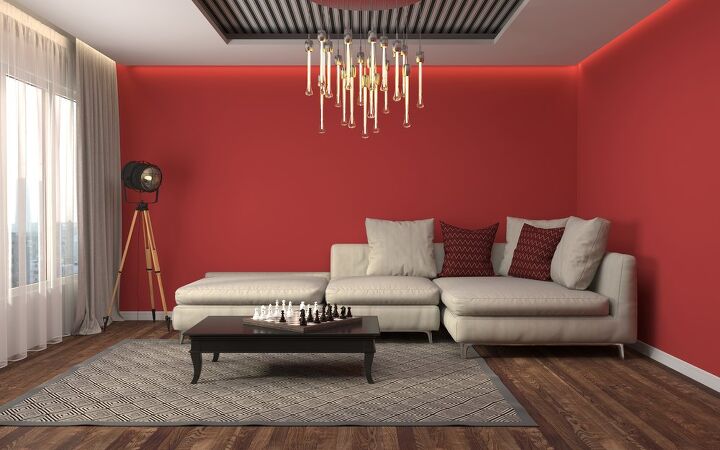
4. Beige
So, here we have a beautiful dining room with red walls and greyish-beige curtains. The beige keeps things a little warm, but still manages to downplay the brashness of the red. When paired with brown furniture and a lot of Victorian accents, it’s easy to see why it works together.
Beige doesn’t have to be a traditional thing, though this definitely seems to be one of the more popular combinations for this style. This is generally a smart move when you want a room to look contemporary, inviting, and yet still a bit formal. Beige works with almost any color scheme you what to put together, so it’s a safe bet.
5. Grey
In the photo above, we see a similar room with a slightly different take on curtain color. (Okay, okay, it’s blind color, but still.) Here, the blinds are a dark grey. Unsurprisingly, it works for the same reasons that beige do. It’s formal, it’s a neutral color that matches with everything, and it also can help a room open up.
With grey shutters, you get a slightly more modern take on this color scheme. It works best if you have a room that has black and white accents, simply because of the monochromatic look it offers. Even when it’s not about monochromatic vibes, grey offers a solid foundation for your room.
6. Cream
Fun fact: the house I grew up in had this color scheme. Cream is a style of white that has a slight punch of yellow in it, not unlike the look of egg nog. It’s a very pretty look that has all the warmth of beige, with a lighter touch. If you are the person in your group of friends who feels like beige is overdone, then you might want to give cream a try.
Cream is a good choice if you want to have the warmth of beige but keep the room opening ability of white. It’s a light reflecting color, you know. This color combination tends to be particularly popular with Mediterranean, Spanish, and Eastern European interior design. It’s gorgeous!
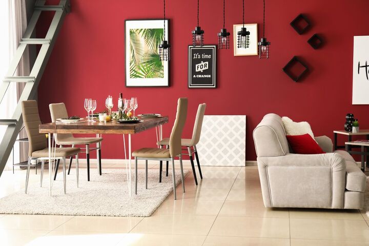
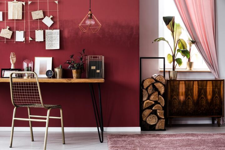
7. Gold
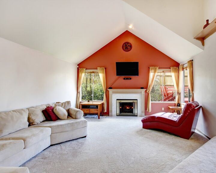
Here we see an orange red statement wall in a crisp white room. (Wow!) If you like the idea of adding a color like this to your home as a statement maker, you might as well go whole hog and add more color to your windows. Here, we see how gold and red work together to create a bold and warming glow throughout the whole room.
In this case, this color combination was used to enhance a modern room. However, you don’t have to stick to modern takes to make this work. It’s just as appealing in a Victorian room, a Baroque room, or a contemporary rustic room. Since yellow and red tend to whet appetites, this combination is particularly popular in kitchens.
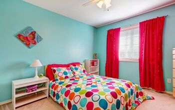
8. Red
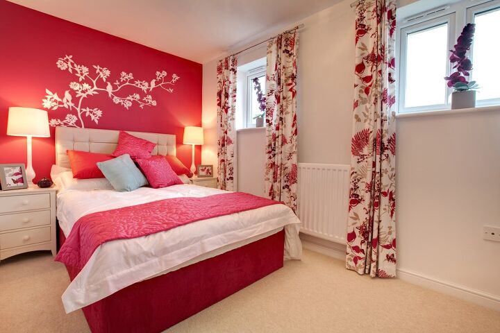
Red on red? Oh, it’s a bit more common than you think. Here, we see a red accent wall that was also emphasized by red bedding and curtains that dig into the “red on white” look that the entire room has. Even a little pop of red on your curtains is enough to create a coordinated look to your home.
People who want to stay strict about having a two-color color scheme will like using red curtains. Why? Because it frees up the rest of the room and accessories for the other color of your choice. Besides, you never have to worry about matching red with red. It’s the same damn color.
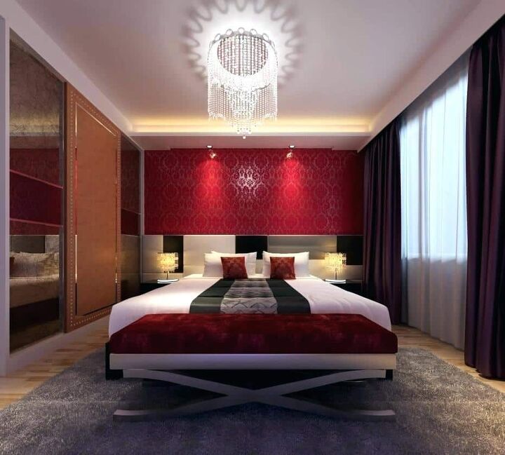
9. Black
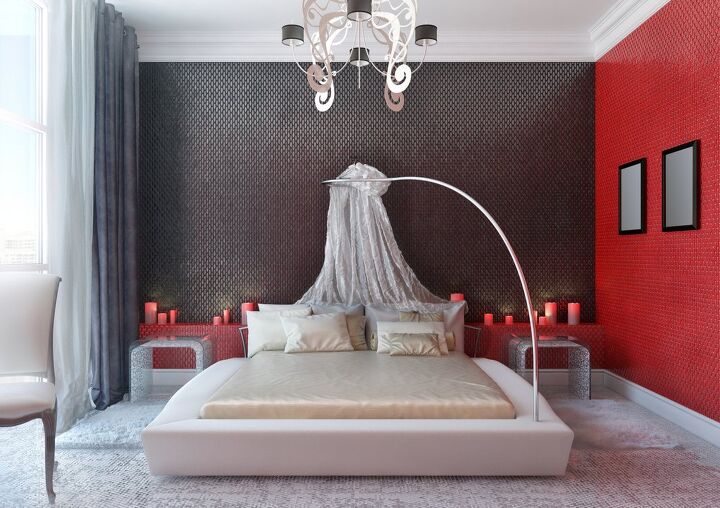
So this entire bedroom has a glorious black, red, and white palette. This is actually pretty popular as far as modern design goes. The curtains are black and white—though the black is hard to see because it appears to be a suede-like material. Either way, this illustration shows the explosive beauty of having a little dash of black in your curtains.
Of course, having black curtains and a red room can be pretty difficult to pull off. It has a tendency of looking dark, glum, and at times, just a little too gothic. Adding white or silver in your home can help brighten it up and make it look less cramped. That’s precisely why the designer of this room added a white carpet and a white bed.
Do You Need an Interior Decorator?
Get free, zero-commitment quotes from pro contractors near you.
Related Questions
Is painting your walls red a good idea?
Red is a fairly popular room color, though seeing it as a wall paint color isn’t quite common. This is because red can be very overbearing and can easily make a room look darkened, even if you have a fair amount of lighting. Most people would prefer to keep red accents like curtains and textiles in the room rather than have the entire room painted red.
What colors should you avoid pairing with red?
Red is a color that can be fairly demanding and at times, even abrasive when it comes to interior design. If you want to avoid having a room that makes people cringe, avoid blue at all cost. Moreover, try to stay away from most greens. While red and green actually complement one another, the truth is that most of us associate that with Christmas.Contrary to popular belief, Christmas in July is not that magical. It’s more of an eyesore than anything, and tends to make a room look too seasonal to really work for other times of the year.
What rooms do best with red walls?
Red is a good color for almost any room, as long as it is a well-designed room. It happens to be particularly popular in bedrooms thanks to the link to the “color of passion” and the warm glow it sets on the place. However, it is not just a bedroom color by any means of the word. It also tends to do quite well in kitchens thanks to its ability to boost appetite, dining rooms thanks to its intimacy, and living rooms, too.

Ossiana Tepfenhart is an expert writer, focusing on interior design and general home tips. Writing is her life, and it's what she does best. Her interests include art and real estate investments.
More by Ossiana Tepfenhart