

Colors That Go Well With Green (for Interior Design)
Although green doesn’t rank high on color popularity when it comes to interior design, this does not mean that it should be avoided. In fact, green is the color of life, nature, energy, and renewal. It is often associated with harmony, growth, and vitality. If that sounds like the type of atmosphere you’d like to create in your home, then don’t knock green until you try it.
This nature-inspired hue comes in an array of light and dark shades, ranging from a vibrant neon yellow to a calming blue. Consider including green in your color scheme to portray a refreshing style. Whether you prefer more of a deep-shade fern or a seafoam green, it pairs well with a variety of colors such as neutrals like gray and brown, and even more vibrant shades of pink, blue, yellow, and more.
If you’re not quite sold on the idea of including green in your interior design, we’re here to help. We’ve put together some excellent colors that go well with green to help inspire you and also educate you on the versatility of this wonderful color.
Do You Need an Interior Decorator?
Get free, zero-commitment quotes from pro contractors near you.

How to Build a Green Color Scheme
Achieving the ideal green color scheme begins by examining the undertones of your preferred shade. Although green is most often considered to be a cool color, some variations can lean more toward brown, yellow, or sometimes red.
Take a look at your particular green color and compare it with various paint swatches. This will help you identify the undertones it has. Then, you can use those colors to determine the other colors to include in your palette.
1. Complementary Green Color Scheme – Coral, Hunter Green & Gold
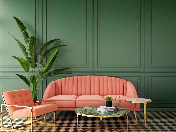
Since red and green are opposite each other on the color wheel, they are natural complements. Pictured here, various shades of green go well with a coral color for a very classy and sophisticated take on a traditional color pairing. The gold accents in the legs of the chair, couch, base of the tables, and even the plant pot help to tie everything together and make the little details pop.
2. Farmhouse Garden Color Scheme – Rustic Woods, Leafy Green & Red
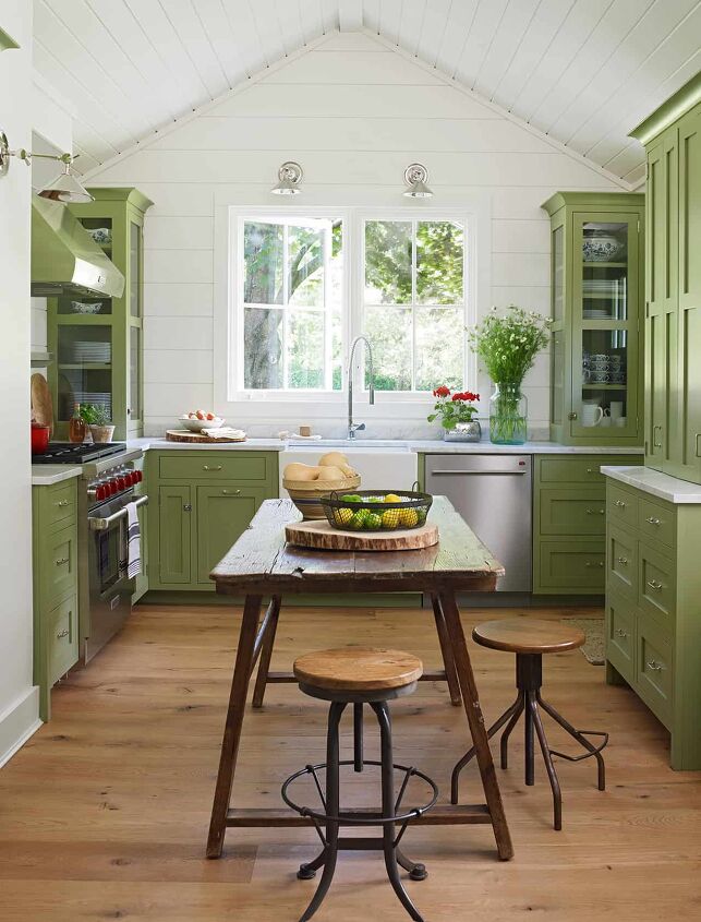
In this example, a light leafy green color helps to bring sophistication to this farmhouse-style kitchen to create an overall design that is both elegant and quaint. The green-hued cabinets offer a fresh look that ties together the lovely view of greenery outside of the windows.
Whereas, the rustic wooden farmhouse table and wood flooring help to level off the palette with a natural texture. The, almost subtle, pop of red in the fresh flowers and accessories also add a bit of vibrancy to the space.
3. Cottage Core Color Scheme – Olive, Celery & White
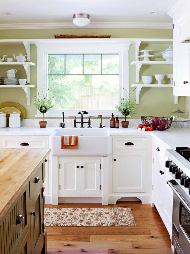
Taking inspiration from that wildly popular cottage-core style, this delightful kitchen features basic cabinetry and open shelving. The color palleted includes a range of colors such as stained wood, red, olive, and light celery. With a light hue on the walls, the space is given a fresh feel.
The olive shade is only limited to the island, and some white paint on the cabinets and shelving helps to further brighten up the space.
4. Beachy Inspired Color Scheme – Lavender & Mint
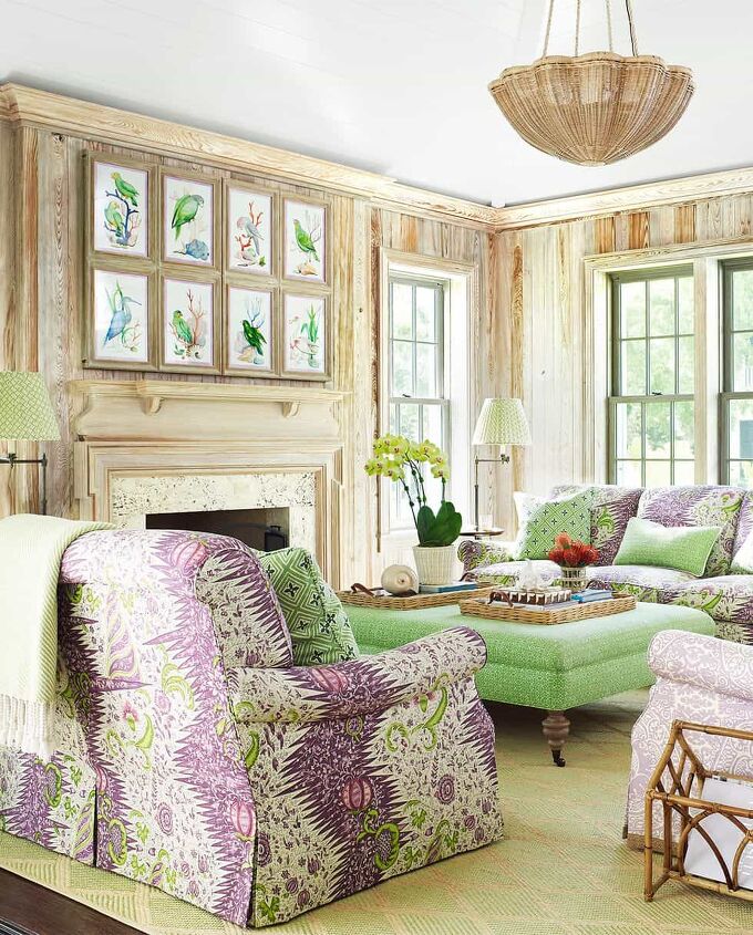
This example offers a very bold take on using the color green in interior design. The mint hue is what forms a basis for this coastal-themed space, which features a variety of shades of purple throughout. While many tend to shy away from this much color, these homeowners embraced it to create a striking sunroom in their Palm Beach home.
The large windows allow in plentiful natural light and the natural wood on the walls contribute to a very happy, welcoming atmosphere.
5. Vibrant Green Color Scheme – Turquoise & Key Lime
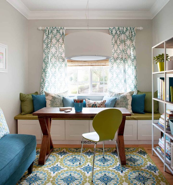
Lively key lime green accents throughout this small dining nook help to energize the space. The bold green shade works very well with a strong turquoise color, which is seen in the rug, fabric of the couch, the pillows, and even the cup on the desk.
The large and appealing prints on both the rug and the curtains add visual interest, which helps to make the space appear larger than it actually is.
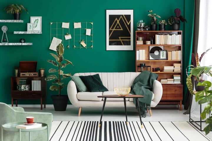
6. Cozy Green Color Scheme – Indigo & Mint Green
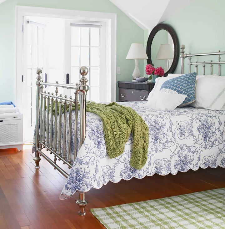
The cool tones of the pale green walls in this image help to emphasize the wintery hues in the indigo floral bedspread and the metal bed frame. Whereas, the addition of slightly warmer shades of green in the rug and knit throw help to tie the whole design together.
Casual and cozy furnishing along with idealistic details, such as the scalloped-edge bedspread, brings warmth to the cool undertones using domestic comforts.
7. Rustic Countryside Color Scheme – Weathered Wood & Avocado
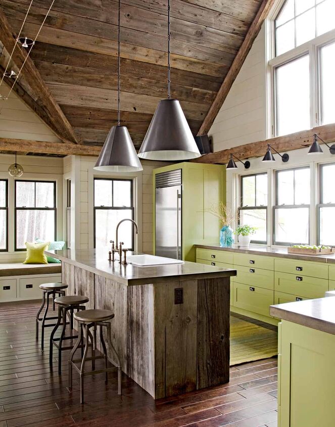
A gorgeous shade of green, reminiscent of a ripe avocado, offers the perfect hue to complement the rustic wood kitchen island, ceiling, and flooring in this country home. The color of the cabinets also plays off of the plant and the apples in the tray.
On the other hand, this kitchen embraces the more weathered natural look with an almost barn-like appeal. Furthering the rough-hewn premise of this space, an extensive wall of windows displays a wooded view.
8. Minimalistic Green Color Scheme – Orange & Seaweed
In this example, it’s very clear that the green, seaweed-like, shade dominates the space. The entire wall is painted in this hue, while the couch is a much lighter hue of green. The plant in the corner helps to tie the greens together, as it consists of a variety of shades. Including orange in this color scheme helps to bring some artificial sunlight to the space.
Accessorizing with a simple orange knit throw and couch pillow adds a little visual flair to this, otherwise, minimal living space. It’s exactly what this space needs to avoid being too washed out with green.
9. Vintage Green Color Scheme – Wine Red & Pistachio
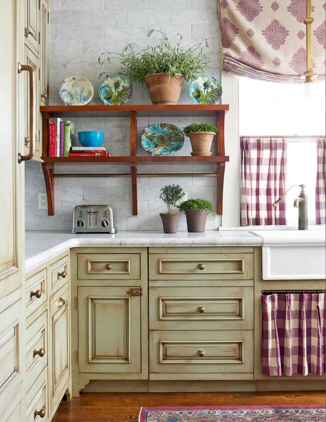
Custom-painted cabinetry in this kitchen offers a nice taste of individuality. The slightly distressed pistachio-like green shade of the cabinets coordinates beautifully with the brass hardware and wine-red accents – such as the under sink skirt and window cabinets.
The finishes and colors used throughout this design work well together to give this new space a bit of vintage charm.
10. Moody Green Color Scheme – Pistachio & Aubergine
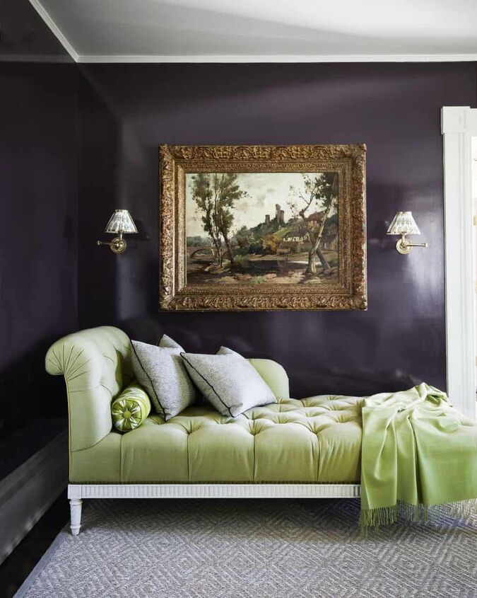
Purple, in all shades, is one color that works well with green. This example offers a much moodier take on the traditional purple and green. The dark, silky walls provide a remarkable backdrop for the large green tufted chaise. While many might think this design is a bit gutsy, it looks effortless in this bright space.
11. Unique Tropical Green Color Scheme – Jade & Magenta
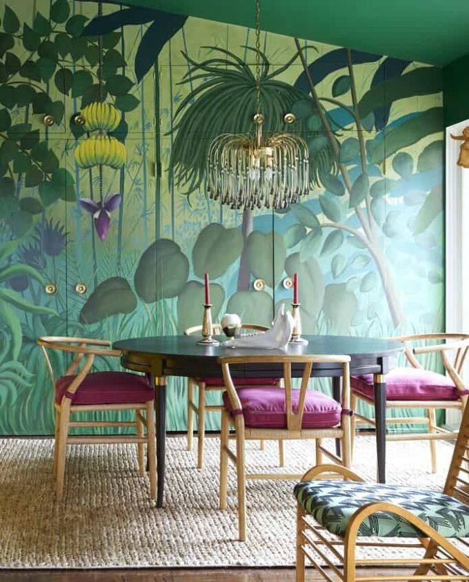
With a Rousseau-inspired mural, this design transforms a dining room into a tropical paradise. The perfect accent to tie this entire room together is the set of magenta seat cushions at the dining table.
12. Neutral and Green Color Scheme – Jade, White & Gray
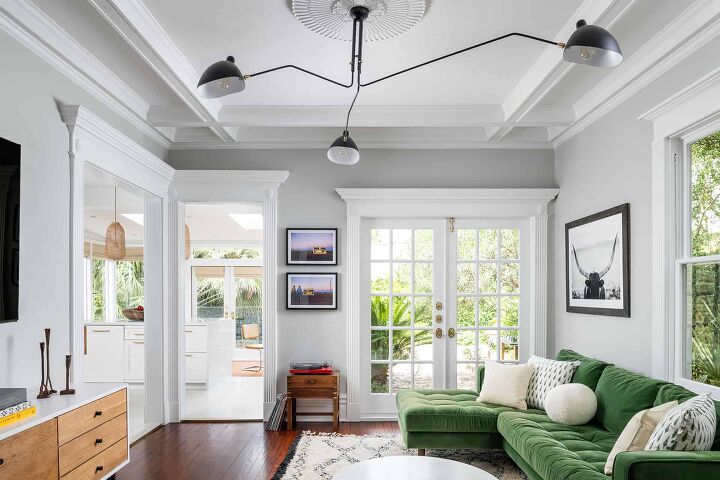
In this example, the jade shade of the couch leans towards the cool end of the spectrum. As a result, it pairs perfectly with neutral colors like white and gray. In this small living room, white trim and light gray walls blend into the background to allow the luxurious green velvet sofa to take center stage. The various accessories throughout the rooms such as the black frames and hardware help to add definition to the space.
13. Country Color Scheme – Natural Wood & Sage
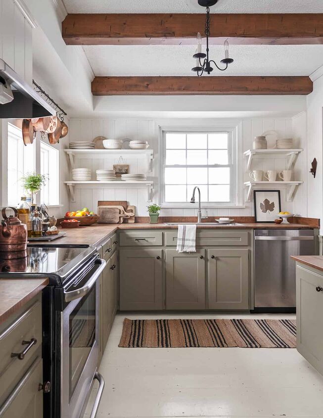
In this design, a very muted shade of sage green serves as a neutral color. The sage hue of the lower cabinets is grounded by implementing white flooring and open shelves for storage. Tall ceilings in this kitchen are emphasized using exposed wood beams, and this natural texture is echoed in the butcher-block countertops.
On the other hand, the vintage copper pots on the rack above the windows help to boost the color palette by adding in a slight shiny visual interest.
14. New Orleans-Style Color Scheme – Citron & Lemon
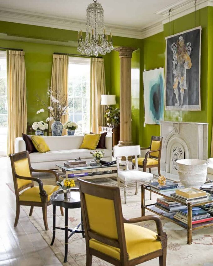
In this New Orleans home, the colors are far from muted. The parlor was transformed into a citrus explosion using lemon-yellow accents and green lacquered walls. Both the white and brown shades throughout the space help to tame the bright yellows and greens. It’s a bold choice but works well in this design, and especially in a very colorful city.
15. Analogous Color Scheme – Summery Blue & Emerald Green
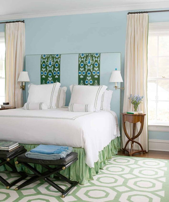
Analogous colors are groups of three colors that exist next to each other on the color wheel. They are always a good choice when mapping out a color scheme and trying to determine colors that go well with green. Blue and green are considered analogous colors.
In this example, an emerald green on the headboard is blended with paler green shades and combined with a variety of blue hues. Although the design features a couple of graphic patterns, they are used with control to maintain a relaxing ambiance.
16. Adventurous Green Color Scheme – Off-White & Kiwi
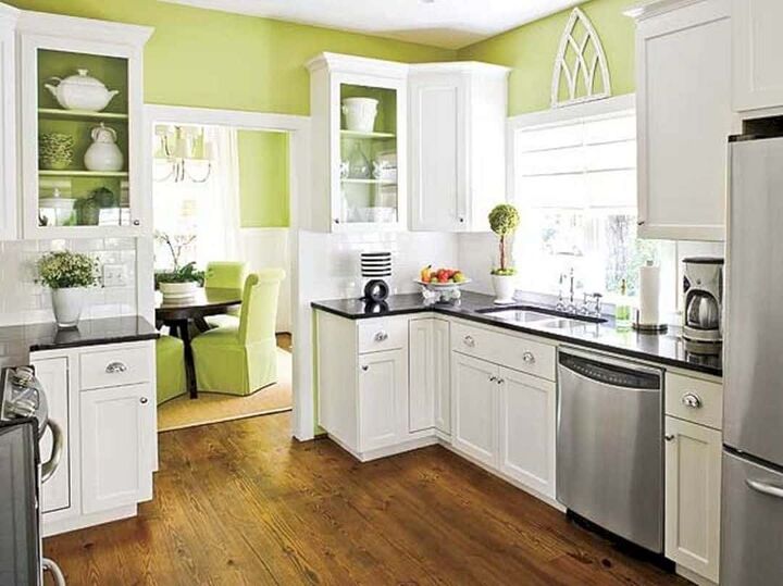
You can transform a traditional kitchen by introducing a green color palette that is bold, yet modest. In this example, the use of white is inverted to serve as an accent color which allows the colors to be splattered with an adventurous green hue that creates a striking look that won’t be ignored.
17. Uplifting Green Color Scheme – Summery Brights & Mint Green
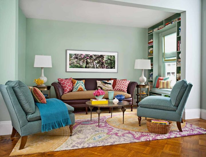
In this design, mint green on the walls and the blue-green shade of the side chairs serve as neutrals. They allow the attention to be drawn to the bright summery accent colors throughout the room. Shades of orange, yellow, pink, and blue create a vivacious and energetic appeal.
The tonal differences and slight variations of that blue-green hue are visible throughout various fabrics and the rugs, ensuring that all of the colors work together in harmony.
18. Calming Green Color Scheme – Seafoam Green & Pale Blue
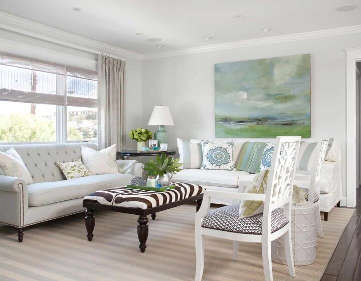
The pale greens and blues in the artwork above the far couch set the tone for this room’s soothing appearance. Both the light gray Chesterfield sofa and the blue and white striped rug make an unobtrusive statement. The other pieces throughout the room are primarily white, except for accent pillows in various patterns of green and blue.
For a complete step outside of the norm, an animal print ottoman takes center stage in the room. Due to the juxtaposition being a just single piece, it provides a burst of energy and makes a noteworthy statement.
Do You Need an Interior Decorator?
Get free, zero-commitment quotes from pro contractors near you.
19. Palm Springs Inspired Color Scheme – Peony, White & Spring Green
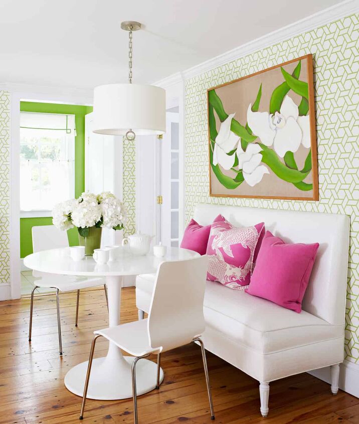
Taking a page out of Palm Springs’ book, this posh dining nook exudes a very sophisticated style of refined beach-goers. Similar to a summer shift dress, the furnishings throughout the space are simple, with clean lines.
Whereas, the hot pink accent pillows (one featuring the image of a koi fish) and the painting of tropical flowers are statement pieces, standing out amongst a primarily white backdrop. Wallpaper in a woven, geometric design lends itself well to the vacation-like appeal and slightly softens the room’s bold qualities.

Jessica considers herself a home improvement and design enthusiast. She grew up surrounded by constant home improvement projects and owes most of what she knows to helping her dad renovate her childhood home. Being a Los Angeles resident, Jessica spends a lot of her time looking for her next DIY project and sharing her love for home design.
More by Jessica Stone


![The 10 Best Table Saws - [2022 Reviews & Buyer's Guide]](https://cdn-fastly.upgradedhome.com/media/2023/07/31/9070645/the-10-best-table-saws-2022-reviews-buyer-s-guide.jpg?size=350x220)
![10 Best Electric Lawn Mowers - [2022 Reviews & Top Rated Models]](https://cdn-fastly.upgradedhome.com/media/2023/07/31/9070486/10-best-electric-lawn-mowers-2022-reviews-top-rated-models.jpg?size=350x220)