

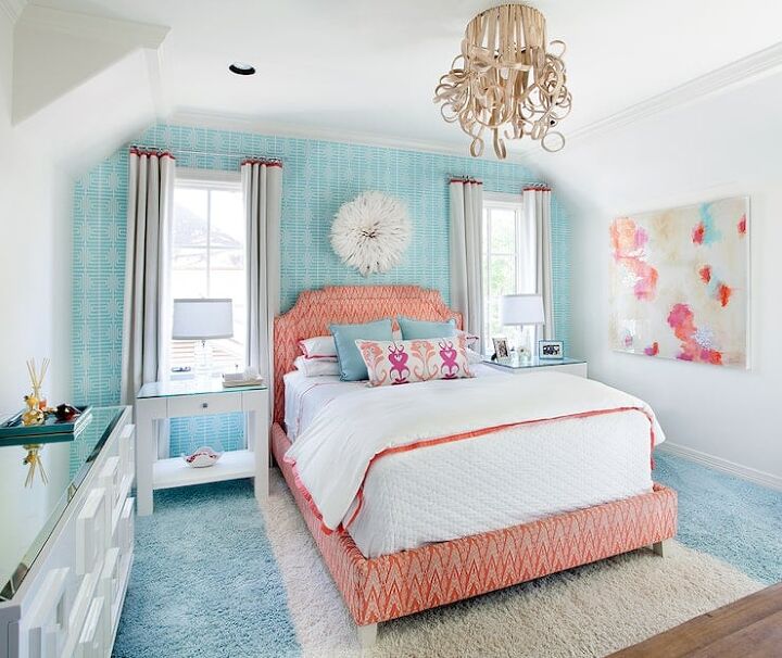
What Color Curtains Go With Aqua Walls?
Aqua isn’t just a Eurodance band! It’s a beautiful light blue that is famous for looking watery and being the center of a coastal Miami color palette. When you paint your room aqua, it’s important to get curtains that work with this uniquely pretty color. You *do* want to maximize that color’s impact, right?
Top neutral curtain color picks for aqua walls include white, grey, and beige. People who want to add a non-neutral curtain color to a room with aqua walls should consider blue, light green, bold oranges, or gold.
This watery color might seem like it is meant for nurseries and bedrooms, but there is so much more you can do with it. Let’s take a look at some of the best ways to pair curtains with it….and get inspiration on the way.
Do You Need an Interior Decorator?
Get free, zero-commitment quotes from pro contractors near you.

What Are The Best Curtain Colors For Aqua Walls?
Aqua is not a neutral color, but don’t be fooled. It is a surprisingly versatile color. Let’s take a closer look at the options.
1. White
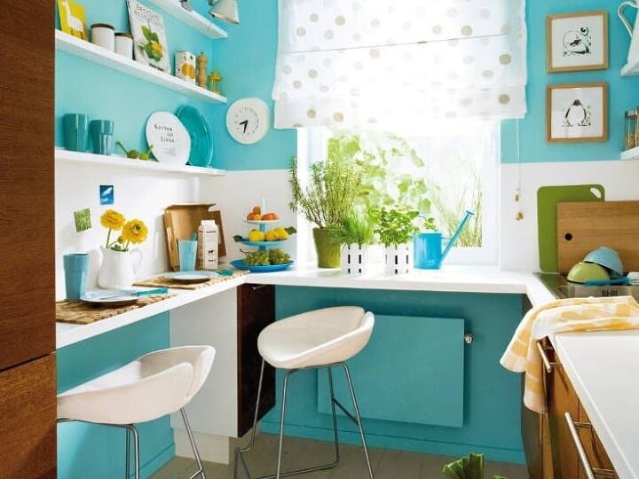
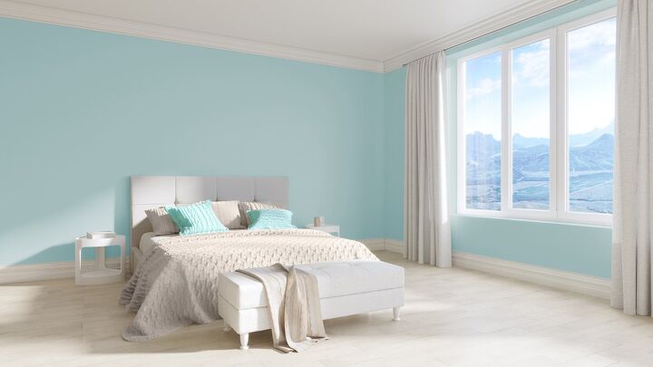
Here, we see a deep aqua with the most commonly-used color you can pair it with: white. Here, white offers up a way to balance out the darkness of aqua and open up a room that is very clearly petite. White has that “opening” effect, especially in rooms that might look gloomy and claustrophobic otherwise.
Aqua and white go together phenomenally well. I mean, this was one of the most popular color pairings of the 1950s for a reason. You might be able to add a third accent color in, too. So, if you are looking for a flexible and versatile curtain color, grab white.
It’s important to recognize that a lot of people tend to think of the color palette of white, yellow, and aqua as a “retro” look. Don’t believe me? Take a look at some of the photos of kitchens in the 40s and 50s. If you are not okay with a retro looking kitchen, don’t use this combination in your home.
2. Pink
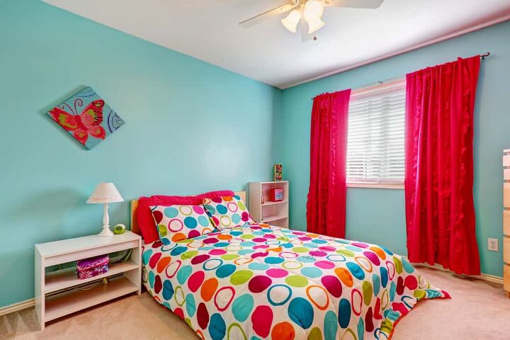
Believe it or not, hot pink can be a really cute contrast to a room with aqua walls. This is not for everyone, but if you are putting together a room for a young girl or want to have a very tropical look, it works. Pink is a complementary color to aqua, so if you want to have a bold contrast, this is it.
Most people think of hot pink and aqua together, then think of Miami. Or, in some cases, it could make them think of certain color palettes in Latin America if they add green or yellow to the mix. Either way, it’s cute, action-packed, and great for the right room.
Pink is definitely the most “hit or miss” color on this list. Even so, it has its fans.
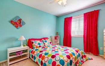
3. Blue
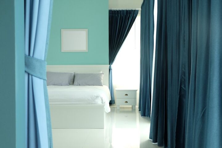
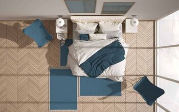
Aqua is not quite blue. It is a lighter version of turquoise with a little less yellow. Unsurprisingly, this means that it is really pretty when paired with various shades of blue curtains. The almost blue-on-blue look gives a room a very multi-dimensional look while it keeps a unified look. It’s not monochromatic, but it’s darn close to it.
Blue is generally just a great choice for curtains. When it’s paired with aqua walls, you get a very elegant look that is slightly warm, and very watery. We suggest pairing these two colors with white, cream, or a slightly pale beige. This gives your room a perfectly beachy vibe.
4. Beige
So, this shade is a little too dark to be aqua, but the actual effect is very much the same. Beige and aqua give a highly warm and appealing ambiance to a room, especially near the window areas. The reason why is simple. Both beige and aqua have slightly yellow undertones. The yellow gives the room a warm, inviting look.
If this color combination makes you think of a day at the beach, you are not alone. Beige is the color of sand. Aqua is the color of the crystal-clear waters of Aruba. It’s a beachy way to get a coastal vibe to your apartment. Better still, it’s classy enough to be used in the finest beach homes.
Beige and aqua act as one of the key color combinations used in coastal homes
5. Yellow
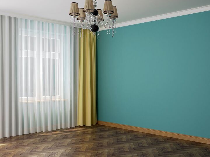
Admittedly, this is not the most furniture-filled room, but it does illustrate a point here. Aqua has light shades of yellow. It’s a lot like turquoise. Adding yellow curtains to a room that is painted aqua is a good way to bring out the yellowness and also add contrast to your room.
Yellow and blue (including aqua) tend to work very well together. These two shades together tend to be particularly popular in Scandinavian style rooms. So, if you are a fan of Northern European looks, this might be the best curtain color for your needs. Besides, who doesn’t enjoy the sunny look of yellow in a room?
We already covered the retro vibe that yellow, white, and aqua can have. If you want to skirt this issue rather than embrace it, go for a green as an accent color. Or better yet, choose a light grey. It’s super stylish.
6. Grey
It should come as no surprise that aqua and grey tend to work together very well. Both of these colors are considered to be on the “cool” end of the spectrum and tend to be on the lighter side, too. Needless to say, they give a room a very unified look. Light grey, in particular, tends to work best with aqua.
If you want to give a home a more modern vibe, then you’ll be happy to know that grey curtains are a smart choice. Grey is a really trendy color right now. Since it is a neutral color, this will work well with any other tertiary color you choose.
We strongly suggest this for rooms that already have two non-neutral colors, or for people who want something that looks very unified. I mean, it’s not just because it’s trendy. It also just looks smart in general, and can make for a great pairing for a young boy’s bedroom. Heck, even grown-ups will love this pairing.
7. Seafoam Green
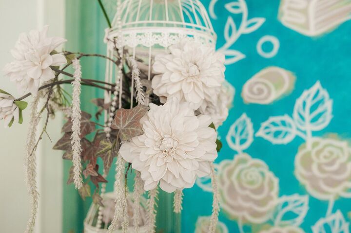
Here we see something a bit unusual. It’s an aqua wall that has a very French, feminine, and floral pattern on it. In the background, you can see a rather unusual pairing with aqua: seafoam green. Seafoam is that green-turquoise color that is often seen as just a little too harsh for most turquoise pairings. However, with lighter colors like aqua, it looks amazing.
The key to pairing seafoam with aqua is to have a way to make it a little more adult. The great of seafoam and the slightly bright look of aqua can make a home look a little too child-like if it’s done incorrectly. (I mean, I’m pretty sure I’ve seen this color combination in Nickelodeon’s theme park.)
To make this curtain color work with your walls, we suggest going for a light grey, a very pale orange, or sticking to beige. Those work well together. Or, you know, you could go for white. It can be made more adult in a pinch, and some might argue that it’s the most adult color you can pair with aqua.
Do You Need an Interior Decorator?
Get free, zero-commitment quotes from pro contractors near you.
Related Questions
Is aqua a popular color for walls?
Aqua is a shade of blue, which is currently the most popular non-neutral color on the market. While this particular shade is not as popular as something like navy blue or a light baby blue, it is still one of the top choices as far as wall colors go. If you paint your walls a nice aqua shade, you are not alone in your choice. It’s quite popular among designers, especially if the room in question is part of a beach home.
What color primarily makes aqua paint?
Technically, the main color that is used to create aqua paint is cyan. This means that it’s primarily a shade of light blue that has a small amount of yellow added in. Not much red/magenta is used in the creation of aqua paint, if any is used at all. If you are not sure whether you can recreate that perfect shade of aqua, we strongly suggest using the same brand of paint that you bought at the store. Writing down the paint color is a smart move.
Why is aqua paint considered to be a retro color?
It’s important to realize that aqua isn’t just for vintage looks. Modern homes use it all the time to create a beachy, warm feel. However, it’s still important to recognize that aqua was a key color that was used in homes and kitchens during the 1940s.When it was paired with midcentury modern style, it was considered to be one of the most common color combinations for people who like the vibe of the idyllic look of the suburbs during the 50s.

Ossiana Tepfenhart is an expert writer, focusing on interior design and general home tips. Writing is her life, and it's what she does best. Her interests include art and real estate investments.
More by Ossiana Tepfenhart