

What Color Curtains Go With Tan Walls?
Tan isn’t just a thing for the Jersey Shore crowd. It’s a popular neutral that adds a darker, almost brownish shade to beige. It’s bold, it’s fun, and it can be paired with almost any type of color. When you first get tan walls, you might be at a loss on what color curtains to buy. Thankfully, we did the digging work for you.
Tan walls go well with white and grey curtains. For people who want to add color to their curtains, blue, turquoise, yellow, and red can all offer up excellent colorings. When picking curtains for your walls, make sure to choose a shade that works with the tan shade you have.
Going curtain shopping can prove to be difficult if you haven’t worked with tan paint before. We’re here to make your shopping trip a little less painful and provide some inspiration in the form of photos.
Do You Need an Interior Decorator?
Get free, zero-commitment quotes from pro contractors near you.

What Are The Best Curtain Colors For Tan Walls?
Though tan is a neutral color, the truth is that it can be difficult to work with in a home because it is a dark color. Let’s look at our picks for awesome curtain pairings that liven up your room and brighten things up.
1. Dusty Blue

Here, we see some tan-colored bricks on a warehouse wall that hosts a window surrounded by dusty blue curtains. This gives the room an interesting faded, industrial vibe that is actually pretty eye-catching. Since the blue has deep grey undertones, it helps calm down the rosy undertones of tan.
If you want something that is easy on the eyes, take a look at this option above. It’s an unexpected way to make sure that you get a splash of color without overwhelming the look of your home. We suggest going with a brick red accent color for this.
2. Tan

Like with most other wall colors, you could always just pair tan curtains with tan wall paint. Admittedly, it is not the most exciting look, but this is not something that has to be a bad thing per se. This illustrates how tan on tan helped create a more monochromatic look in this traditional dining room.
Tan on tan has a stately look that can work with any colors that you want. In the case above, it actually was part of a monochromatic look designed to help add class and neutralism to a home. Of course, if you just want to showcase a painting or two with bright colors, this color combination will help your paint act as a great background for it.
3. Green

Green has the perk of working with any color that tends to have brown undertones. That includes tan, or this interesting tan-taupe color that we see in the illustration above. In this particular photo, we see a chartreuse green for the curtains. This helps add a little more of a golden hue to the room and also complements the plants they have.
The good part about having green curtains is the psychological effect it offers up. Green has a naturally calming effect on people while also keeping things gender-neutral. Fans of having a fresh, open look to your home will want to pick a light green, while people who want a regal vibe will prefer a dark green.
4. Light Yellow

You see those really short light yellow awning curtain things hanging off the windows in this beautiful room? It’s not just you. They’re there, subtle, and they also work well with the rest of the stunning decor. Yellow and tan work together for all the same reasons that beige and tan do.
If you want to kick up the warmth, yellow curtains will make this happen. Here, we see this pairing work a beautifully glamorous, old school Florida style in a home. Since light yellow reflects light well, it helps keep things looking bright and sunny throughout the day.
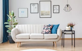
5. Dark Grey

Here we see something that most people would never expect from a room with tan or beige walls: dark grey curtains. Grey and beige work together, so it’s not surprising that tan and grey work well too. The key here is to choose a shade of grey that is similarly dark to the tan on your walls. The matching values make the room look more streamlined.
Of course, dark grey with dark walls can make a room look a little gloomy. That’s why we suggest this pairing for rooms that have ample lighting and large windows, like the room in the photo above. Greys that are lighter than the tan on your walls can look a little awkward, so try them out before you toss the reciept.
6. Orange

So we got another uncommon (but starting to gain steam) trend we wanted to point out on this list. This list features a dark tan wood wall, grey and black accents, and a ton of orange. It also has orange curtains, which tends to be one of the colors most people tend to assume to be too risky for a typical home.
Let’s just be clear. Orange and brown look amazing together, in that “simmering ember” type of way. It’s warm, but at the same time, has a very sleek and modern vibe. Despite it being a modern look, it actually was a fairly popular combination in the middle part of the 1970s and late 1960s. So, it can work both ways.
7. Brown

Unless you have not rented a hotel room in the past 30 years, I’m going to assume you’ve seen this in a hotel during your travels. It’s a classic look that became the go-to pairing for almost every major hotel chain I’ve been to—Sheraton, Wyndham, and the Marriott have all used this combination either during the past or present.
This is a good color combination if you want to have something that looks inviting, sophisticated, and just a little professional. Since brown curtains are fairly easy to clean, you also can bank on a slightly lower maintenance schedule as far as cleaning. If you want something that has an upscale feeling without it being too personal, then this is a good choice.
8. Royal Blue

I’m going to use the wood accent boards as “walls,” simply because they do not seem to have many photos of rooms that work with tan walls and royal blue. However, the illustration above proves a good point about why this works so well. Tan is a warm, sandy color that has a naturally beachy feel.
When you pair it with royal blue, it’s a bold combination that makes you go WOW. The brightness of royal blue is a perfect complement for the tan walls, and it also adds a certain electric look to your room. Despite all the bright vibes, royal blue can also act as a soothing addition to your home.
If you want something that can work for an exotic motif like Moroccan decor, then royal blue is it. On a similar note, this color is great for people who want to have something that’s classy and sophisticated. After all, there is a reason they call it “royal blue.”
Do You Need an Interior Decorator?
Get free, zero-commitment quotes from pro contractors near you.
Related Questions
Is tan a good color for a wall?
Tan can be a good color, but it often can be a bit too dark for smaller rooms. If you want to go for this color, choose a tan that’s on the lighter side of the spectrum since it will be able to reflect light better. If you have a large room that you are trying to make warmer and cozier, tan is a smart move.
What rooms work best with tan walls?
This is a bit of a subjective topic, because you really don’t have a bad room as far as paint options go. Tan is a neutral color that can be worked into almost any room you could imagine. However, it is a warm color. This makes it a good choice for rooms where making things look inviting is a major goal.If we had to use tan paint for any rooms, we’d definitely use it for kitchens since it can help make food look more appetizing due to the way it plays in light. Sunrooms and living rooms would be a close second.
What are the differences between tan and beige?
At first glance, there aren’t too many differences between tan and beige. Both colors are technically a spectrum, so you can find some tans that are light enough to be a dark beige and vice versa. The main difference people note is that beige is closer to a light cream color. Tan is darker, and tends to have a more golden brown look than beige does.If you take a closer look, many people might also note that beige tends to have a slightly more grey tone in many cases. Tan, on the other hand, is almost never grey-based. That’s taupe, not tan.

Ossiana Tepfenhart is an expert writer, focusing on interior design and general home tips. Writing is her life, and it's what she does best. Her interests include art and real estate investments.
More by Ossiana Tepfenhart