

What Curtain Colors Go With Cream Walls?
Cream is one of those colors that is extremely common in homes, but is often overlooked. It’s easy to see why. Many people who have poor sight (myself included) tend to assume cream is just white. But, it’s not. Cream has a slightly buttery yellow undertone. So, what kind of curtains go with cream walls?
Neutral colors like ivory white, beige, tan, and grey are the most common curtain colors to pair with cream. Non-neutral curtain color choices people enjoy include blue, yellow, green, and red. Almost any color will work with cream.
You really can’t go wrong with a wall color like cream. It’s a neutral that has just the slightest touch of warmth. That makes it a great color for adding a pretty glow to your home.
Do You Need an Interior Decorator?
Get free, zero-commitment quotes from pro contractors near you.

What Curtain Colors Go Well With Cream?
Cream is one of those few colors that can truly work wonders with any curtain color. Even so, we found some colors that are extra chic. Check out our advice below!
1. Light Beige/Ivory
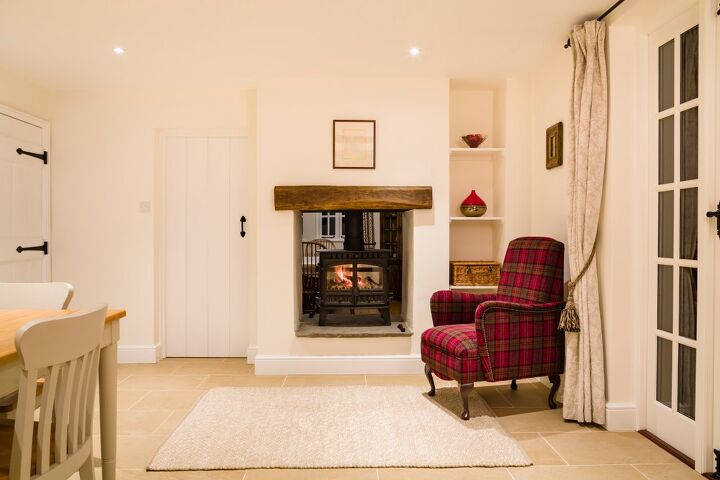
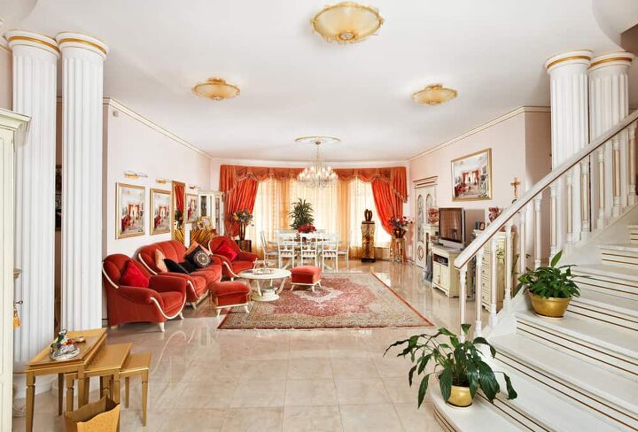
If you want to add a little extra warmth to your home without making things too heavy-handed, you might want to look at a light beige or ivory color. In this photo, we see a country home that has an ivory, white, cream, and beige palette. This gives it a very monochromatic look. To add color, the designer included a bright red tartan chair.
Cream tends to go well with almost any shade of white or off-white that you could get. This makes curtains like the ones featured in this photo a shoo-in for almost any home. Best of all? Ivory tends to reflect light well, which means that it can make a small room like this foyer look amazingly large.
2. Yellow
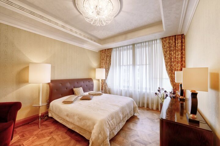
Cream is one of those colors that tends to get enhanced with the presence of yellow, which might be why the designer of this swanky bedroom chose yellow curtains with red rose embroidery. Both colors are known for adding a warming, cozy glow. It’s a gorgeous look that is often used in luxury hotels for that very reason.
Of course, you don’t have to stick to both yellow and red together. Most people tend to go for yellow when they have a cream room. It’s a sunny color that reflects light well. It also makes the room look more welcoming without cramping things down too much.
3. Red
We already did a little number on how yellow works out as a curtain color in rooms with cream walls, but did you see red yet? Red curtains and cream walls are basically a staple of Eastern European decor, especially if you are closer to the Mediterranean side of things. It’s gorgeous.
Red’s main attraction is the fact that it’s bold, bright, regal, and warming. Because red tends to be such a showstopper, people tend to use it when they want to make a room’s look “pop.” It’s quite popular in modern decoration palettes because it has such a striking look. If you want something that looks Mediterranean or exotic, red is a smart go-to.
4. Grey

At first, grey does not seem like it would go with cream. However, it really works wonders. As you can see in the photo above, the wall is cream with some beige wood accents. Grey has a cooling effect, while cream tends to be warm. Together they offer a very subtle, gentle contrast that makes your home look amazing.
Since they are both light colors, people aren’t going to feel like they’re cramped in. Quite the opposite, really. This will give your room a modern, crisp, and fresh ambiance. Needless to say, this will help others feel like they are right at home. Who doesn’t like unwinding in a place that feels and looks clean as can be?
5. Aqua
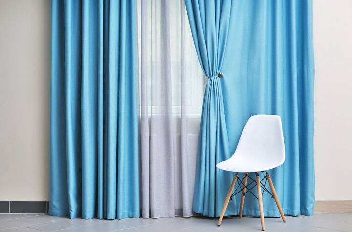
This image is a bit sparse, but we can still see the cream wall and the aqua-c0lored curtains. This pairing works for the exact same reason that grey and cream do. The cream is slightly warming, while the blue tends to add a cool touch. Aqua has just the slightest bit of cyan to it, giving it a yellow undertone.
Blue is also one of the most popular home decor colors in the world, so it’s safe to say that it’ll work well as far as moods go. You can mix blue with almost any other color on the color wheel with decent results. This combination, therefore, is a classic that you can rely on for good results.
While aqua is definitely our shade of blue of choice for cream, let’s make something clear. Any shade of blue will mesh well with cream. Blue’s versatility as a color can’t be understated.
6. Dark Sage Green
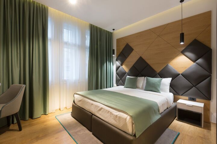
Ignore the giant wood and leather headboard, and focus on the cream wall behind it. As you can see, the cream of the wall and sheets made the room feel warm, without going for a hackneyed route like beige. The curtains in this room are a dark sage green that’s almost standard sage green, but just a little bit darker.
The grey-green of the curtains works well with cream because it keeps things looking earthy. While cream is not often found in nature, it can be reminiscent of stone and white sand beaches. When you pair dark sage with cream and taupe leather, good things happen on a visual level. It looks so organic, doesn’t it?
7. Tan
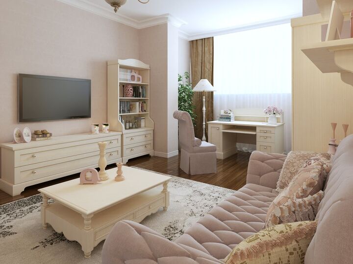
Are you a fan of homes that have a monochromatic look? If you are, or just want to have a pastel palette the way this photo above does, you know that you often need some dark to balance the light. When you want to keep your room colors unified but don’t want to interrupt the flow of your home, it’s best to go for a darker neutral.
Tan is the darker version of cream—to a point, anyway. Both are neutral and have strong yellow undertones. Certain cream colors can also have a slightly brownish look to them, too. Since tan offers a warm look while keeping things neutral, it tends to offer a nice way to tie a room together.
Most people who choose tan curtains do so when the rest of their room is done up in pastel. This is because having too many dark colors in a room can make it look cramped. However, if you have a very large room, tan curtains will make it look cozy.
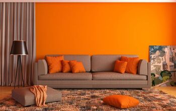
8. Orange

Cream tends to be particularly pretty with curtain colors that have a yellowish base to them, for obvious reasons. Here, we see cream walls that are paired with brown and orange curtains. Orange curtains help bring out the golden and sometimes rosy tones of cream. In other words, it makes your home have the same ambiance as a creamsicle.
Before you balk, just realize I don’t mean that in a bad way. This color pairing is a great way to add a lot of toasty warmth, giving your room an inviting glow. Cream is light and neutral enough to prevent your home from looking overbearing with this often fiery color.
If you are looking for a color palette that is unexpected and totally beautiful, don’t hate on orange curtains. They might be the uniquely pretty choice you never knew that you wanted.
Do You Need an Interior Decorator?
Get free, zero-commitment quotes from pro contractors near you.
Related Questions
Is cream a good color for walls?
Most homeowners tend to prefer white or cream for their walls, simply because both colors offer a high degree of versatility. Cream tends to be better for homes that want to add yellow tones, or at the very least, want something a little cozier. The yellow undertones tend to give homes a soft glow when light reflects off the walls.
What is the difference between cream and off-white?
Off-white tends to be very close to white, with only a little “drop” of color in it. It’s possible to have a wide range of “off-whites,” including ones that have blue and yellow tones added to them. It’s white, but not really white. You know what we mean?Cream, on the other hand, doesn’t fully look white in the eyes of most people. It tends to have a distinct yellow tint, much like the creamer you put in a coffee or tea. While it is still technically a shade of white, most people might find themselves calling it an “ultra light yellow” depending on the lighting. In some lights, it does look yellow.
What colors should you avoid if you have cream walls?
Cream is a neutral, technically. So while some colors are more preferred as a choice, the truth is that they tend to work with any color that you pick. When choosing a color, you still should try to see how it looks when you put swatches together. You might find that some colors suit your style more than others. After all, everyone has different tastes.

Ossiana Tepfenhart is an expert writer, focusing on interior design and general home tips. Writing is her life, and it's what she does best. Her interests include art and real estate investments.
More by Ossiana Tepfenhart