

What Curtain Colors Go With Orange Walls?
Lately, I’ve started to gain a healthy appreciation for the color orange. This is doubly true in interior design. I add orange roses to my table, bring orange doodads to my rooms, and emphasize orange candles. It’s just the vibe I like. If I get a house of my own, I might want to have orange walls. But, what kind of curtains would I get with orange walls?
Orange walls do best with neutral curtain colors like white, beige, tan, and brown. If you want to choose a non-neutral color, using blue or yellow curtains will help bring out different elements of orange without causing problems with your room’s appearance.
If you want to have orange walls, you’re going to have your work cut out for you. It’s not an easy color to pair with, and many people tend to go “overkill” on it. To make things easier, we loaded up an article with inspiration.
Do You Need an Interior Decorator?
Get free, zero-commitment quotes from pro contractors near you.

What Curtain Colors Go With Orange?
Bold and fiery, orange is one of those colors that you have to take care with when you work with it. Let’s check out some of the best pairings for this wild color.
1. Cream
Cream isn’t quite white. It’s off-white that has a little touch of yellow to it, like the sheer blind curtains here. If you ask me, cream is the best neutral because it doesn’t come off as harshly as white would, but it still has all the perks of white. Cream is warm, inviting, and light-reflecting. This makes it a great choice for people who want to “open up” a room.
If you have a small room that you want to make into a cozy nook, cream is what will do that for you well enough. This color combination also has a little bit of a sweet look to it, much like an Orange Creamsicle. Isn’t that just plain yummy?
2. Brown
I’m a huge fan of this retro color pairing, and so should you be! Here, we see a very light orange wall color that was accented by brown curtains. Brown offers an earthy glow that is warm. When you put brown and orange together, they tend to give the room in question a very rustic yet modern vibe.
Together, these give you a deeply warming look that is perfect for a room meant for intimate conversations. Depending on how you style it, you can make this a perfect look for a dining room, a living room, a kitchen, or even a more masculine bedroom.
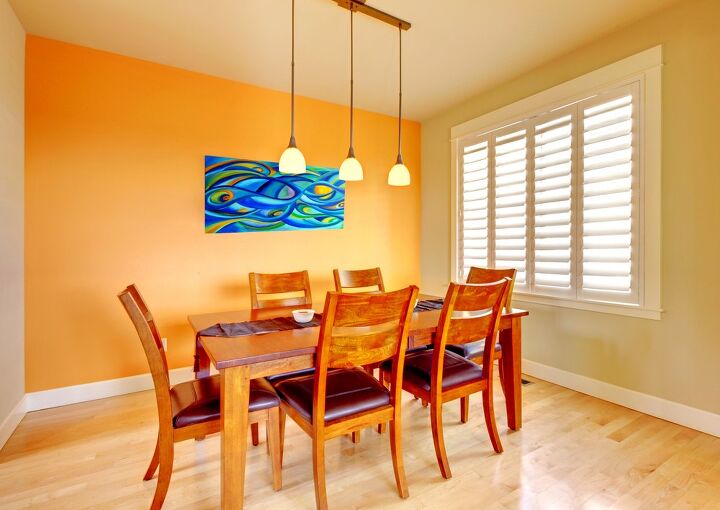
3. Light Yellow
If you have a bolder orange along the lines of this red (or orange?) shade, then things are going to be tricky. You can’t go with something too bold, because it may make the room look lopsided or otherwise crowded. A gentle touch tends to be the best possible tool for the job here.
Pale yellows and light yellows like the ones above tend to help bring out the red in orange walls. This enhances the fiery look of your home without making it look too rough or cramped. In the case of an accent wall, like the one here, you might want to stick to yellow simply because of the way it frames everything.
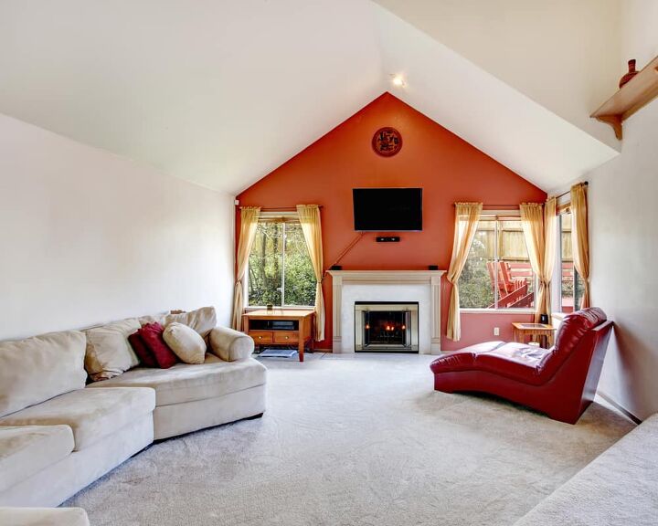
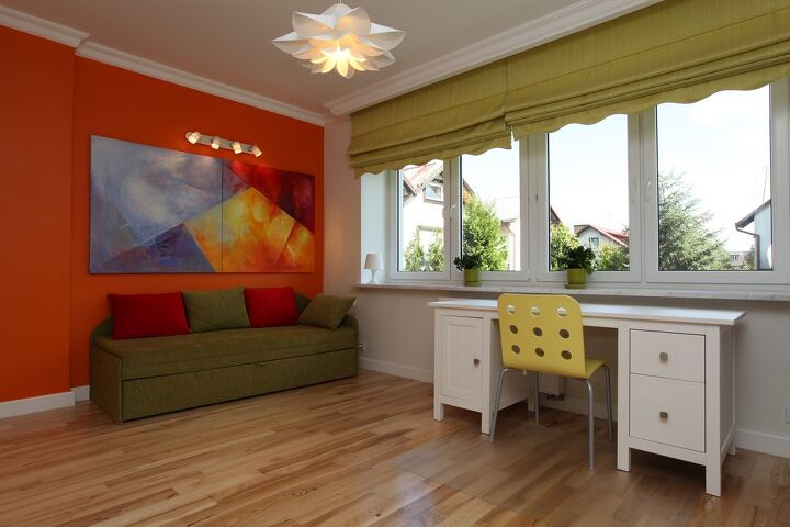
4. Grey
Are you a fan of making a room look a little more masculine? Orange can be a fairly manly color, especially if you pair it with a lot of traditionally masculine colors. One of the more popular neutrals to pair with orange is grey. Grey tends to have cool undertones that balance out bold reddish oranges like a “burnt sienna.”
Grey curtains will give your room a rustic and manly vibe. In this cute illustration, we see a room that has a ton of orange, grey, and wood accents. It feels so cowboy-ready, doesn’t it? Such is the charm of having the right shade of grey curtains in an orange room.
5. Blue
Blue is one of the most visually striking curtain colors that you can get for a room that has an orange wall like this one. (Okay, well, orange cabinets.) This is because blue is orange’s complement, which means that it will pop out and give your room a bold contrast that is hard to beat. It’s a statement color, that’s for sure.
This is a good color combination if you are aiming for a bright and bold contrast. Darker blues work well as a manly combination, especially when you’re trying to go for a “varsity color” angle. Lighter blues, on the other hand, tend to give a very “Miami” look to your home. No matter what shade you pick, you really can’t go wrong.
Because this tends to be such a bold look, we suggest using light blues for modern rooms almost exclusively. It can look a bit too jarring if you try to mix these colors with something like Baroque.
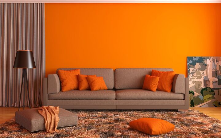
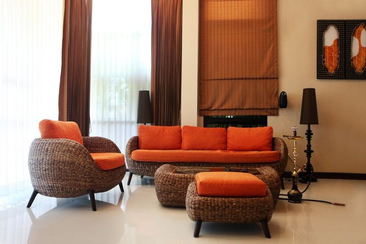
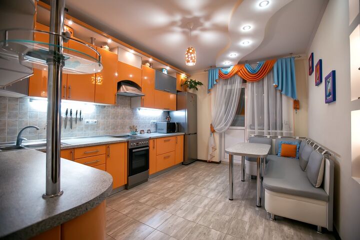
6. Orange
Orange, like all other colors, can always be paired with itself. Here, we see a very light orange that has a subtle tint that would make someone second-guess what they are seeing in the right lighting. To help enhance that look, the designer here ended up choosing a darker orange curtain for the sink’s window area.
This is a good way to give a room a unified look that is modern, sleek, and cohesive. If you aren’t sure what you want to do with your room or just want to amp up the orange, this is a smart look. Our advice is that you should opt for curtains that are at least five shades lighter or darker than your walls.
7. Green
So, I’m a bit divided on this look. Personally, I think that orange and green tend to remind me of pumpkins and Halloween when they are put in an interior design room. However, I’m not always right. During the 60s and 70s, seeing orange walls with green curtains was a fairly common occurrence. Heck, it was downright trendy.
Fans who love modernizing retro elements will find this to be a good pairing for their home. Here, we see bold orange with an avocado green. The end result is something that gives you a “California fresh” look that you can feel cozy in. If you are a fan of the trippy vibes of the 60s, this might be a good way to bring them to life at home.
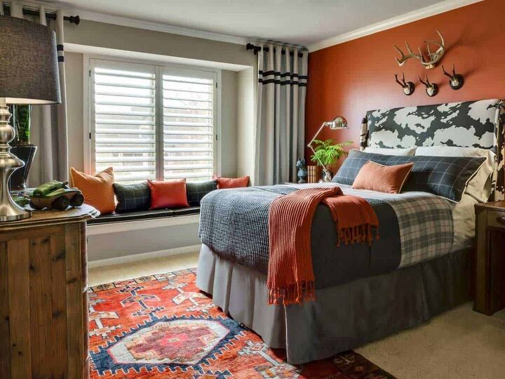
8. Taupe
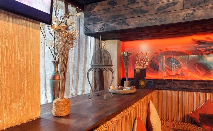
Taupe is not quite beige, not quite grey, and just a little bit darker than the rest of the beige family. That’s precisely what we’re seeing as the curtain color in this incredibly upscale restaurant corner. Here, we see a lot of red, orange, and burgundy. We also get to see a little bit of gold glitter on the walls and dark wood accents throughout the booth.
When you have a color palette that’s as warm as this, you occasionally need to find a way to tone down the “fuego.” Taupe is a good choice for this. Since it is (kind of) a beige, it still meshes well with the warm colors of orange and maroon. However, taupe is one of the only beiges that has seriously cool undertones. That gives it more of a balance.
With that said, anything that involves a blend of beige and grey would fit this bill pretty well. Even griege can work well with the right lighting.
Do You Need an Interior Decorator?
Get free, zero-commitment quotes from pro contractors near you.
Related Questions
Are orange walls considered to be dated?
Orange walls definitely had their heyday in the middle of the 1950s and early 1960s. In the past, the particular shade of orange that people admired was “harvest gold,” which was a yellow-orange shade. Those days are gone, but the trend of orange walls still remains quite popular.Rather than harvest gold, more modern designers tend to work with shades of orange that are bold and bright. If it looks like it could have been a swatch taken from a clementine, you probably got a good shade.
Is painting your bedroom orange a good idea?
Orange might be a cozy color, but it is not a popular bedroom color by any means of the word. Most shades of orange are too lively and energetic to work well in a bedroom. At times, it can actually make it hard to fall asleep in the room.If you want to have an orange bedroom, make sure to go for a pastel orange or a rustic burnt orange that looks warm rather than a “Nickelodeon” orange. That’s just too bright!
What is the worst neutral color to pair with orange?
While it can look great in paintings or comic books, mixing orange with black in your home can look rather awkward. Black and orange are both extremely bold colors that tend to act like a punch of color. Too much boldness will make your room look like a Spirit Halloween stand. It’s just too much, and it won’t end up looking good–even if black is a neutral color.

Ossiana Tepfenhart is an expert writer, focusing on interior design and general home tips. Writing is her life, and it's what she does best. Her interests include art and real estate investments.
More by Ossiana Tepfenhart


![Cost To Drill A Well [Pricing Per Foot & Cost By State]](https://cdn-fastly.upgradedhome.com/media/2023/07/31/9074980/cost-to-drill-a-well-pricing-per-foot-cost-by-state.jpg?size=350x220)