
What Color Countertops Go With Maple Cabinets?
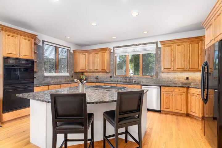
Ah, maple cabinets. The golden undertones of maple are a traditional staple in country homes, not to mention folks who love a classic Ivy League aesthetic. It’s not surprising, then, that maple cabinetry is still in high demand around the world. The hard part with maple cabinets, though, is trying to find the right countertops to work with them. So, what gives?
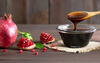
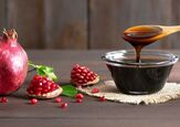
Granite colors that work best with honey maple cabinets are black, white, and gray. You should avoid using tan and gold granite countertops with honey maple as they clash with the maple’s yellow tones. Darker, reddish-brown granite can contrast nicely with honey maple cabinets, and if you want to go very bold, try red granite. Stainless steel and brushed metal go well with maple cabinets whether they have a light or dark stain.
Figuring out which countertops will work with your kitchen’s vision is never easy. Follow along as we explore the best colors for your countertops to pair with maple cabinets.
Do You Need to Hire an Architect or a Builder?
Get free, zero-commitment quotes from pro contractors near you.

The Best Countertops For Maple Cabinets
Getting a good countertop for a setup with maple cabinets isn’t always easy. This is a good reason why it pays to stick with some tried-and-true choices like the ones below.
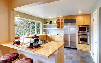
1. White Granite/Marble
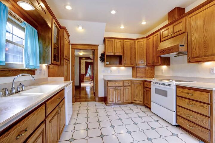
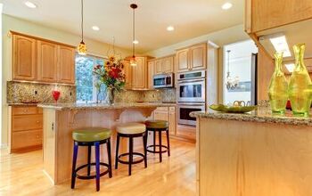
White is the universal option for almost any home improvement project involving colors. It’s unsurprising to hear that white is one of the best colors for a countertop that has a cabinet pairing with maple. White brightens up the kitchen and also helps the area look larger than it really is.
If you are a fan of a crisp, clean look, then you will love white countertops. You can get a white counter through laminate, marble, or white granite. Quartz countertops also work well here, since many types of quartz and quartzite tend to be on the whiter side of things.
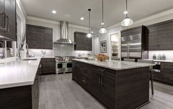
2. Dark Grey Granite
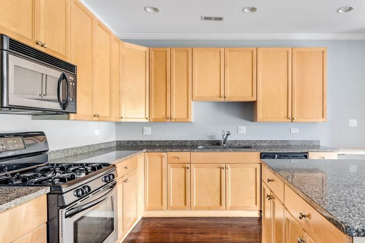
When you want to bring out some style but don’t want to go for a fully bright kitchen, take a look at granite in a deeper grey. Dark grey granite offers a lot of contrast to the bright, often sunny golden hues that maple tends to have. Granite has a penchant for having a wide range of different patterns, which means that your countertop will have a textured look.
The grey in granite often has blue undertones, which can help balance out maple and other yellow-rich woods like honey oak. It’s a modern look, for sure!
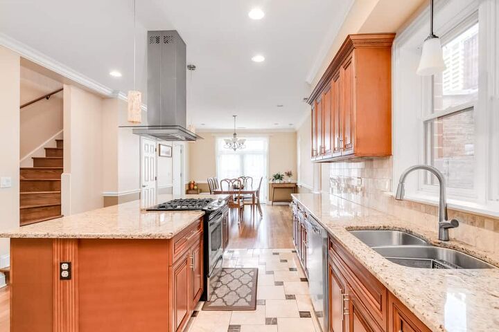
3. Light Grey Quartz/Marble/Granite
Light grey is always going to be a welcome addition to any kitchen, primarily because it’s both modern and works to “open up” a kitchen. While you can use it with lighter maple stains, light grey’s true time to shine is with darker maples like the one pictured above. This is a gorgeous contrast, just begging for the right kitchen or bathroom to make its home.
Light grey works particularly well in smaller kitchens that feature darker maple stains. The widening look that light countertops offer makes it a prime option for cramped spaces.
4. Black Granite
Are you looking for a bold countertop color? Like, really bold? Then look no further than black granite or black marble. How black looks with your wood cabinetry depends on how dark the wood stain is. This makes it a remarkably dynamic countertop choice for almost any type of wood.
Black offers a striking contrast to maple’s light appearance, much like dark grey. This gives your kitchen or bathroom an edge, bold look like the illustration above. In the case of darker maples, it can complement the look of the wood. Black with dark maple cabinetry gives your kitchen an elegant and sophisticated flow few other countertops can.
With that said, black is not a countertop choice for every kitchen. If you have a small kitchen, then black might make your room look extra congested. Choose your counter wisely if you’ve got a “mini-kitchen.”
5. Stainless Steel
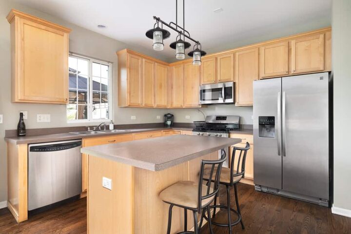
If you are looking for a way to geet your home a hypermodern vibe, then look no further than stainless steel. This is a countertop material that has a similar look to light grey granite, but has extra textures that most counters won’t. Stainless steel can come with a painted appearance, like the one above, or the classic brushed metal look like the refrigerator.
This is a great choice if you like your appliances to match your countertops. Moreover, it’s worth pointing out that stainless steel is the go-to option for people who want to set up a professional-grade kitchen. This is because stainless steel is easy to maintain, not to mention safer for food prep than concrete.
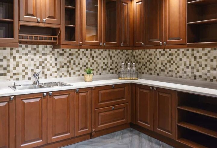
6. Light Beige Granite
Light beige granite countertops can be a little bit of a gambit with maple, but it can still work well if you want to make sure to bring out the rosy undertones of darker maple washes. The problem with beige is that the wrong shade of beige can make your kitchen look downright red. It’s weird, right?
To get the best possible results, you will need to make sure to get a beige that is a true neutral. In other words, it can’t lean too much towards yellow or red. It should almost resemble sand. Sometimes, you can get a similar look from poured concrete. In some cases, a concrete countertop is actually better since you have more control over the color.
How To Match Which Color Granite Goes With Honey Maple Cabinets
Choosing what interior style you like must come before deciding on your granite countertops. Once you understand what style you like, everything else will fall into place. Within the past few years, more sleek and modern styles have been popular such as minimalism, mid-century, and Scandinavian.
Recently there has been a rise in more maximalist, eclectic designs: bright colors, vintage style wallpapers, and rich textures. This is a reflection of early Art Nouveau and Art Deco as well as more modern retro styles from the 70s.
Your home should reflect who you are as a person. Feeling safe and relaxed in your home is so important for both mental health and quality of life. Taking time to understand who you are and what you want in your home will always make a difference.
At the end of the day, your kitchen should be where you feel most at home. Creating a safe and relaxing space for your family to gather can be as simple as choosing a granite countertop.
Honey maple cabinets are a common choice since their rise in popularity in the 80s and 90s. Before choosing which color granite goes with honey maple cabinets, it’s necessary to understand a few things.
Many factors go into selecting the best granite to match your cabinets. Tones, contrast, and texture are a few examples of elements that can alter the look of granite. By implementing these elements, you’re able to elevate your space from a blank canvas to a true home.
Honey Maple Cabinets: Undertones
Undertone is one of the most prominent players in interior design. Colors are notoriously finicky when it comes to lighting. What may appear to be a cool white in artificial light can turn into a buttery white in natural light.
Overtone is the color that you perceive, and undertone refers to the “color that you can’t see.” Many people overlook undertones when picking a color, but combining colors with non-complementary undertones can disrupt a cohesive space.
Honey maple cabinets have warm undertones, which means that some part of your granite countertops should reflect warmth. This could mean choosing a warm granite, like brown, or granite with warm veining. This will create a cohesive and complementary space.
There are no rules about using all warm or all cool tones. In fact, combining both creates a more dynamic space.
However, it is generally best to stick to one tone, warm or cool, for major areas, like cabinets and countertops. Smaller pieces, like rugs and decor, are great ways to experiment with combining tones.
Granite Countertops And Honey Maple Cabinets: Contrast
Contrast is one of the most critical elements in interior design. Contrast gives a space life and movement, a sense of depth, and drama.
You can use contrast in several ways, from combining light and dark to sharp and soft shapes. One of the easiest ways to implement contrast into your kitchen is to use light and dark colors together. For example, honey maple cabinets have light colors, so choosing a darker granite can help break up your space.
Spaces with less contrast will present as modern, think Scandinavian or minimalism. Conversely, areas with more contrast will show as more eclectic or bohemian.
Granite Countertops And Honey Maple Cabinets: Pattern
Pattern is fundamental when it comes to wood and granite. Grain is the term for the natural patterns in wood, and veining is the term for the pattern in granite.
Each type of wood has a specific grain. Maple has one of the most challenging grains to classify but can typically be described as a straight and fine grain. It is common to have knots in the wood, but it typically isn’t the most complex of grains.
Granite has hundreds of colors and patterns, each slab donning unique and intricate veins. There are three main pattern styles in granite: speckled, marble, or solid.
By using marbled granite, your space will have more contrast creating drama and movement. If you choose a more solid or monochromatic speckled granite, your room will come across as contemporary or sleek.
How Color Choices Affect Your Space
The available space in your kitchen is vital when choosing countertops to go with your honey maple cabinets. If you have a smaller or enclosed kitchen, lighter colors are your friend. Lighter colors will open your space and make it feel bigger.
In contrast, darker colors can potentially make your space feel smaller, especially if it lacks natural light. If you have a large or open kitchen, darker or more contrasting colors will create a more dramatic look.
What Should You Avoid When Matching Counters To Maple Cabinetry?
There are two major no-no’s when it comes to maple cabinetry: too much yellow, and too much red. We’re going to explain both reasons why right down below.
The Problem With Too Much Yellow In Your Countertop
Much like honey oak, maple cabinets can be tough to match. It’s very easy to make these cabinets look too yellow due to the heavy gold undertones they have. That’s why having gold-hued counters is a major mistake. This can make your entire kitchen look overwhelmingly gold, even to the point that it could stress out your eyes. (Wild, right?)
The bigger issue with having an overly yellow kitchen is the fact that it looks dated, and not in a good way, either. Emphasizing yellow in woods was a very popular thing to do in the 80s and 90s, and to a lesser point, the 70s. Since the 2000s, this look went out of style, and we don’t expect it to come back anytime soon.
The Problem With Too Much Red In Your Countertop
At first glance, red and the golden tones of maple could look good. However, it’s got the same type of issue as too much gold. Red and yellow are both super warm colors, and they can look great together in the right situation. Unfortunately, when it comes to kitchens, too much red can be overly warming. This is doubly true when you are dealing with lots of yellow.
When you pair reddish countertops (think: red cherry counters) with the golden tones of maple, it can look pretty visually jarring. At worst, it can look like your designer (or you) tried way too hard.
Are Maple Cabinets Still In Style?
Absolutely. Maple cabinets still offer a beautiful country style that can also be jazzed up into a modern look. While it’s not as versatile as white birch washes, it’s still a popular choice that can be done up in dozens of ways. The important thing to keep in mind is the style of the maple stain you’re using.
You can usually find a good pairing by examining the darkness of the stain that your cabinets have. Dark maple stains can be pretty dramatic, and often have similar pairings to what you’d find for cherry and mahogany washes. Meanwhile, lighter maple stains work well with countertops that you’d pair with birch.
Do You Need to Hire an Architect or a Builder?
Get free, zero-commitment quotes from pro contractors near you.
Related Questions
What color backsplash works well with maple cabinetry?
Backsplashes that work well with maple tend to lean towards the greyish end of things. Colors like seafoam, grey, mint green, white, and light beige tend to work well with this wood stain. When in doubt, look for a pastel or “faded” type of color. This will help tone down the harsh yellow undertones that people tend to associate with.
What kind of granite countertop doesn’t work well with maple cabinetry?
While maple can hold its own against most other cabinets, the truth is that there are some options that don’t bode well for this wood. More specifically, uba tuba granite tends to be a major no-no. Uba tuba might pair well in theory, but in practice, it’s a highly overused granite style. It will make your entire kitchen look notably dated, even if you just redid it last month.Unless you’re doing a highly unusual take on this granite, you shouldn’t even consider using uba tuba.
More Related Guides

Ossiana Tepfenhart is an expert writer, focusing on interior design and general home tips. Writing is her life, and it's what she does best. Her interests include art and real estate investments.
More by Ossiana Tepfenhart