

What Color Backsplash Goes With Cherry Cabinets? (Find Out Now!)
Cherry cabinets are pretty popular, even though some might consider them to be a bit too old school. Honestly, we see the appeal. Few wood stains have that bold, beautifully ruddy look that cherry offers. Its rosy hue makes for an amazing punch of color for a typical kitchen, all while keeping things traditional. Trying to pair a backsplash with this cabinetry can be tricky though, so if you need help, you’re not alone.
If you have a cherry cabinet setup, the best backsplashes are going to be the ones that are light neutrals. So, beige, light grey, and white tend to be top contenders. If you need to feel a little more color in your life, then adding pastel shades like pink and green can work well with the rosy undertones of cherry.
Getting the right shade can make your home look amazing. Getting the wrong shade can make your kitchen look weird. This guide will help your backsplash selection be easier than ever before.
Do You Need an Interior Decorator?
Get free, zero-commitment quotes from pro contractors near you.

What Are The Best Backsplash Colors For Cherry Cabinets?
I’ll be the first one to admit that cherry cabinets are pretty finicky when it comes to color pairings. To help you out, I grabbed some of the most beautiful inspiration shots out there.
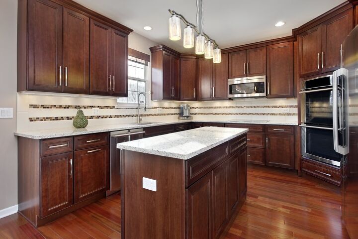
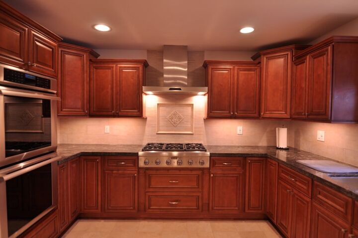
Beige
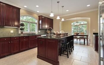
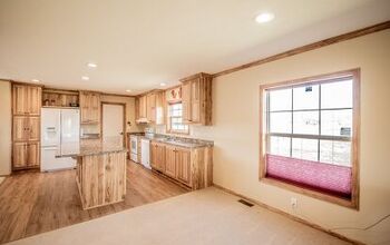
Oh, this kitchen is just gorgeous! It also happens to be a good example of why beige backsplashes pair well with cherry. This beige doesn’t overwhelm the room and acts as a good contrast to the richness of cherry wood. Many homeowners find it hard to keep a home looking open and well-lit with cherry cabinets simply because cherry is so dark.
The design above helps alleviate that by offering up a bright and cheerful contrast. While it may seem a little surprising to see cherry with such as light counter and backsplash, there’s no denying that it works well. Beige is also a soft contrast so it won’t be too jarring.
White
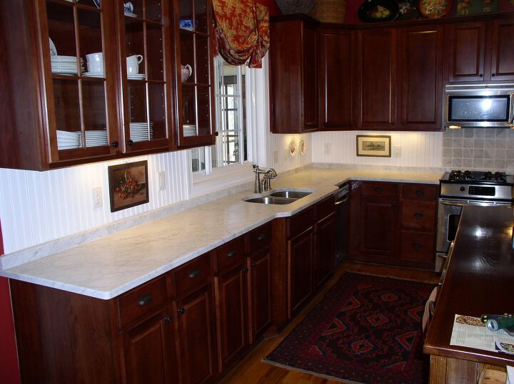
White backsplashes are a classic (and classy!) pick for virtually any type of dark wood stain. The same can be said about darker cherry wood cabinets. This particular designer decided to go with a light countertop as well as a white wood panel backsplash for their kitchen. The end result is pretty dramatic in its own right.
This is a good choice for people who want to have an authentic Victorian look in their home. While it’s not for everyone, it absolutely can help make your home look uniquely gorgeous in the right light. We suggest choosing a lighter cherry stain if you are working with a particularly small kitchen.
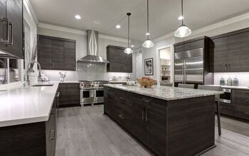
Light Grey
Light grey is still in the middle of a major influx of love from both designers and influencers alike. It’s easy to see why. It’s a modern neutral color that is remarkably elegant with almost every type of wood stain. This is true, even with tougher stains like the ones you see in maple cabinetry.
Grey can help open up a room and give it a larger appearance, even when it isn’t a big kitchen at all. This shade is a good way to balance out all the red in the cabinet stain, which can help you ensure that the kitchen won’t be visually overwhelming. We strongly suggest it if you aren’t sure which color is right for you.
Light Pink
Pink? You betcha. This is a suggestion that actually flies in the face of typical interior design advice. Most people do not want to see a lot of red on red, but hear me out. With the right shades of cherry and pink, it can work. Here, we’re seeing a beautiful example of a warm kitchen filled to the brim with blushing pink.
This gives the home a gorgeous glow that almost looks surreal, even when the lighting is a crisp white. If you are a fan of pink, then don’t be afraid to give this unlikely look a shot. The one thing that we can guarantee about this look is that you’re bound to get some compliments on it. If you have a Southwestern home, then this look will fit right in with the rest of your home’s decor.
Light Blue
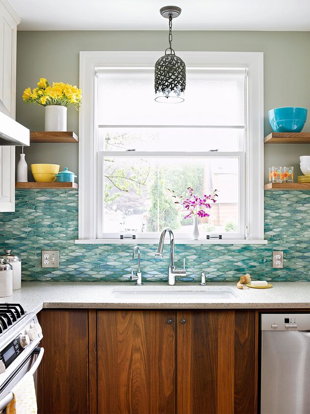
Light blue is a great pick for people who love cherry cabinets but want to add a bright contrast to their kitchen setup. The aqua look of the blue tiling here actually helped make the cherry cabinets below stand out more. Since the cabinet is a sandy white, it also gives the entire kitchen a nautical vibe.
Many people wrongly assume that cherry cabinets cannot be used in a coastal home’s kitchen. This isn’t true. Cherry can give you a seafaring, driftwood vibe with the right backsplash. It’s food for thought. At the very least, you won’t have to worry about having to fish for compliments with this kind of setup.
Mint Green
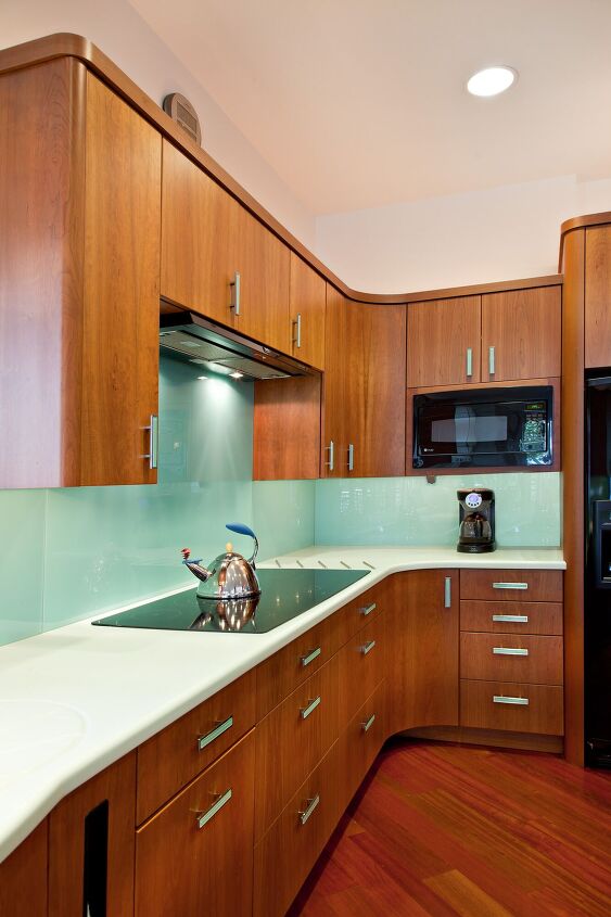
If you love the idea of getting a gorgeous pairing that offers up a contrasting punch of color, then look no further than mint green and cherry wood. Cherry is bold and red. Mint green is soft and has a delightfully retro look that people will just eat up. Together, the green balances out the cherry red, all while giving you a stylish contrast people will adore.
This is a kitchen color combination that can be a bit wild, especially for homes that are not known for using edgy decoration techniques. The reason why it’s edgy is pretty easy to see. It is a direct throwback to the days of the 1950s, which makes it a perfect choice for people who want to have a major dose of midcentury modern flair in their kitchen. You could say it puts the “kitsch” in “kitchen.”
One note that we want to mention about this look is that it can be hard to accessorize with this color scheme. So, if you want to make this work well, set aside a large budget for retro-modern kitchen accessories. They can be pretty pricey.
Do You Need an Interior Decorator?
Get free, zero-commitment quotes from pro contractors near you.
Related Questions
What color tile goes well with cherry cabinetry?
Cherry cabinetry will be a bit difficult to match tiling with, but that doesn’t mean it’s impossible. The two most popular color choices for tiling include white and slate grey. However, you can also match cherry cabinetry with a honey oak floor tile or match a colorful backsplash to the floor tile. For example, if you have a mint green backsplash, a green tile floor might look pretty good.
Is cherry furniture out of style?
That’s a common misconception. Cherry furniture is often seen as dated or out of style, but that’s just not true. It’s timeless. The key to making cherry furniture look modern and trendy is choosing the right accessories and paint to help match the wood stain. Today, white and light neutrals are the most common go-to’s among designers.With that said, some people do believe cherry furniture is out of style. If you pair it with Victorian furniture, dark burgundies, and red, then you will probably have it look a little bit too old for its use.
Are cherry cabinets expensive?
If you want to go for real cherry wood, then you might want to brace yourself. This is one of the more expensive hardwoods to buy, and with the current steep price of wood, it’s going to cause a large pain in your wallet. Thankfully, there are ways around the high price point. Reclaimed cherry and cherry-stained pine are both more affordable than real cherry wood currently is.With that said, we would totally understand it if you wanted to get MDF that is made to look more like cherry. It’s a common way to get affordable kitchen cabinets without too much problem.

Ossiana Tepfenhart is an expert writer, focusing on interior design and general home tips. Writing is her life, and it's what she does best. Her interests include art and real estate investments.
More by Ossiana Tepfenhart


![12 Washing Machine Brands to Avoid [with Recall Data]](https://cdn-fastly.upgradedhome.com/media/2023/07/31/9075781/12-washing-machine-brands-to-avoid-with-recall-data.jpg?size=350x220)